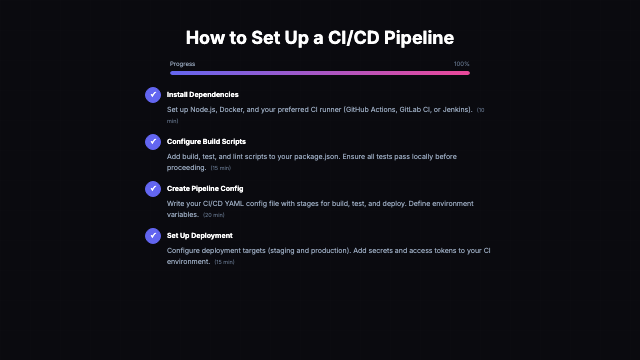
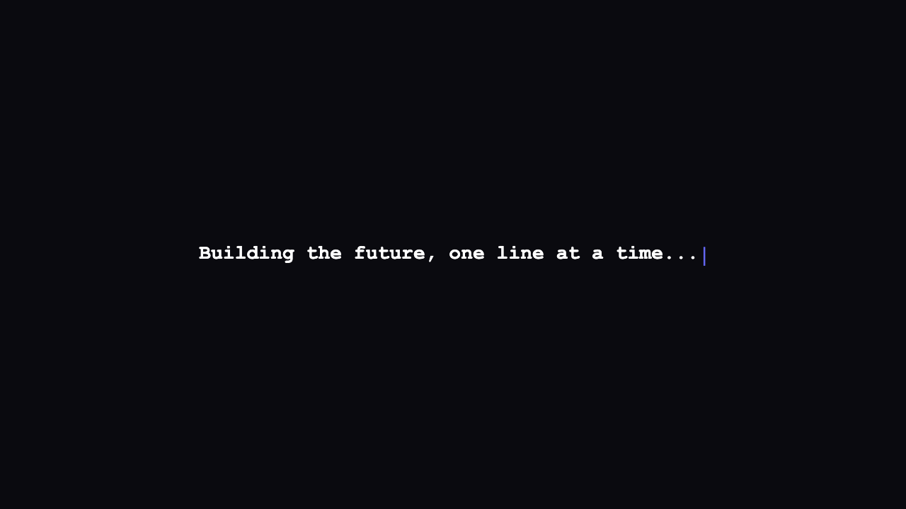
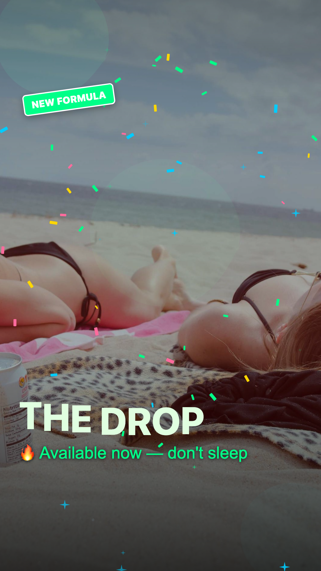
All 101 template types
1638 compositions across 101 templates. Every template supports every theme above. Click to see all variants.
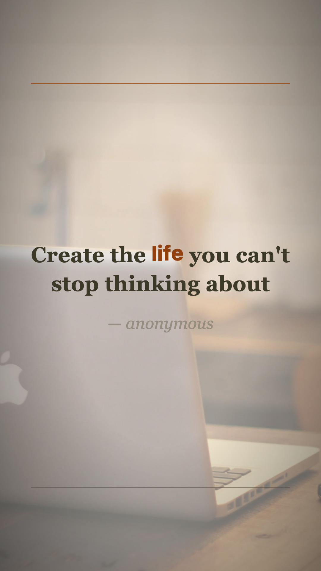
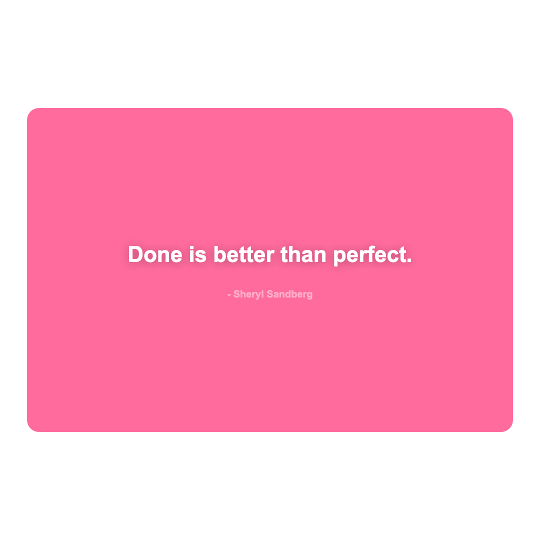
Aesthetic Quote
2 variants
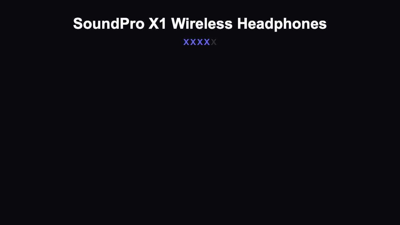
Affiliate Review
16 variants
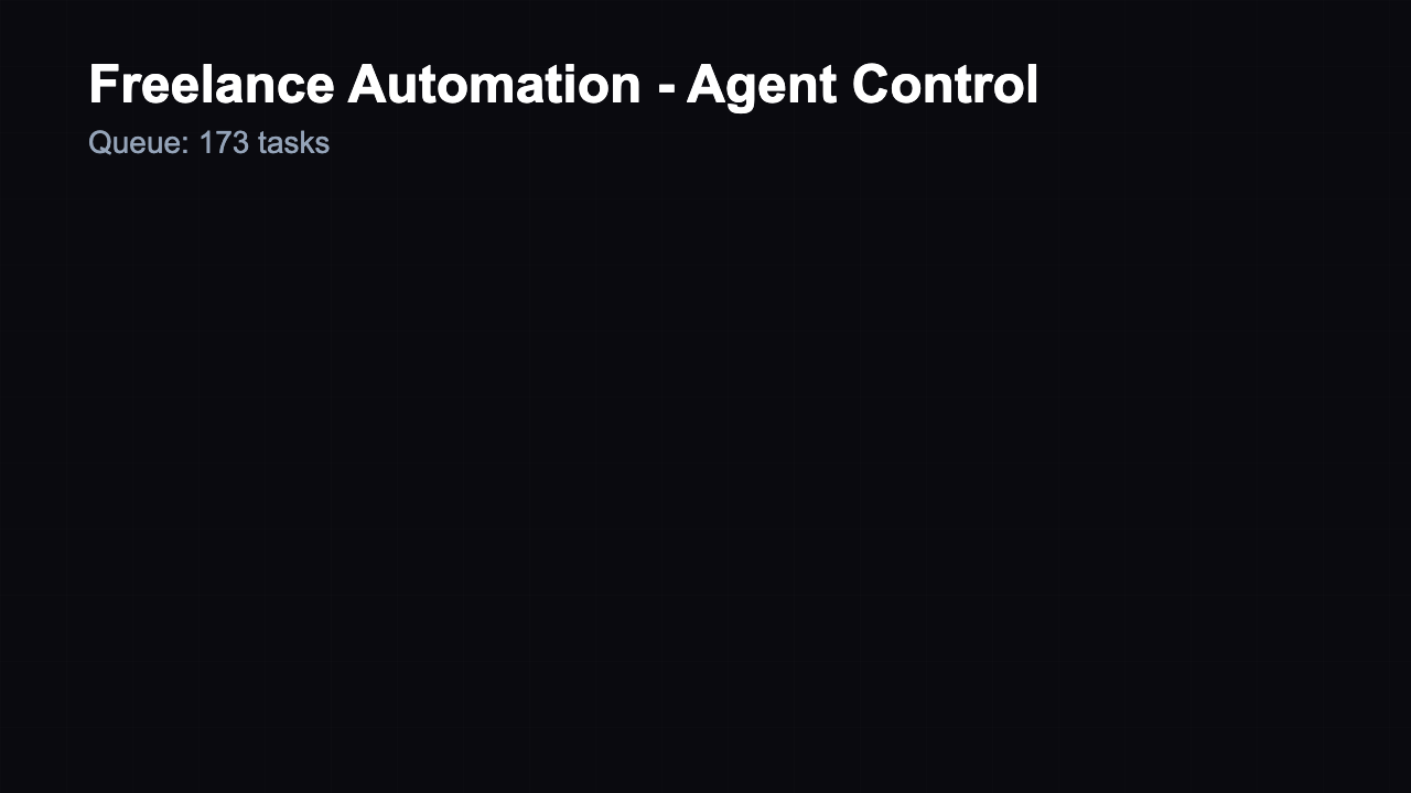
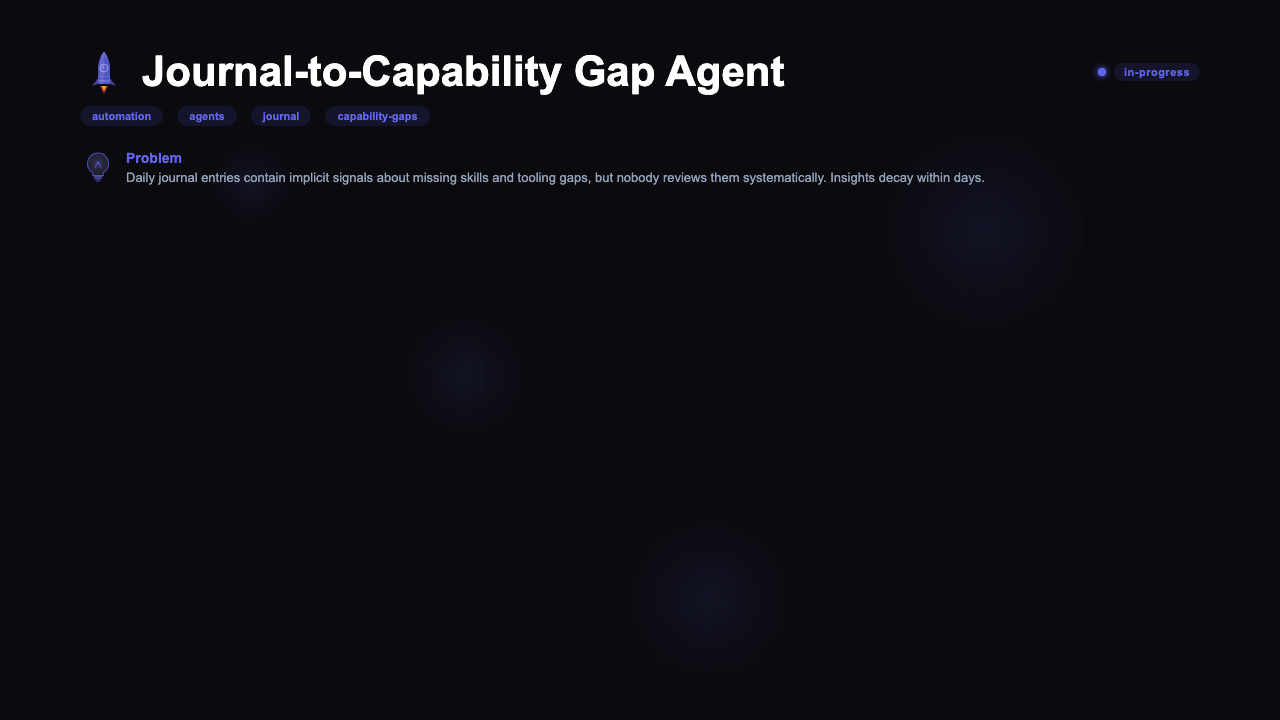
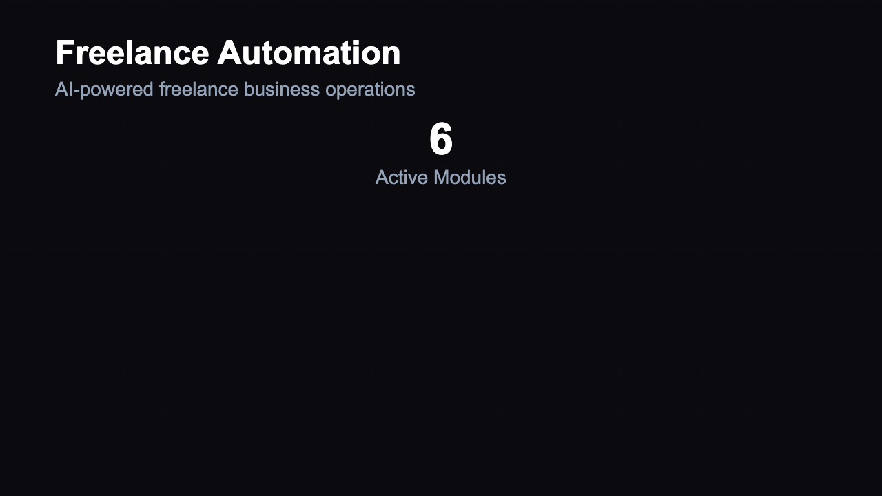
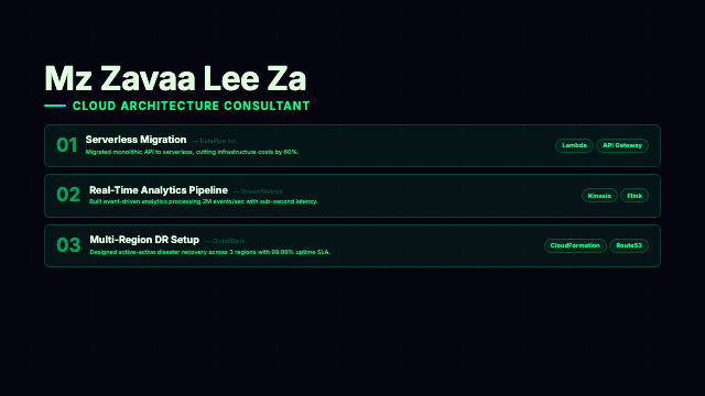
Agent Dashboard
16 variants
Animated Icons
2 variants
Animated List
16 variants
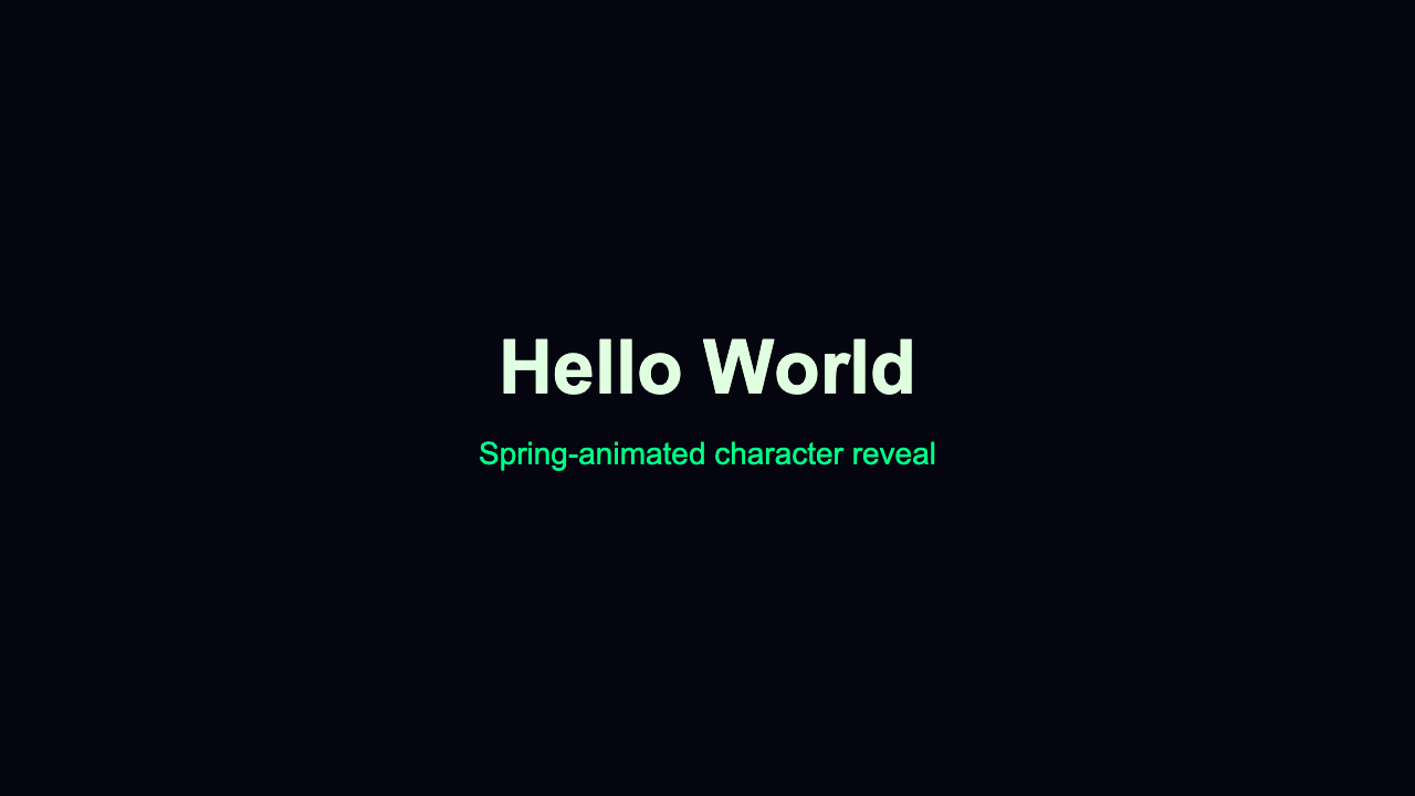
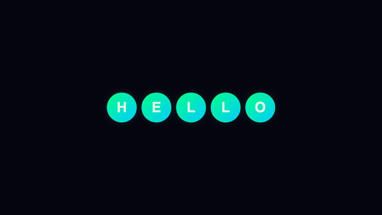
Animated Text
16 variants
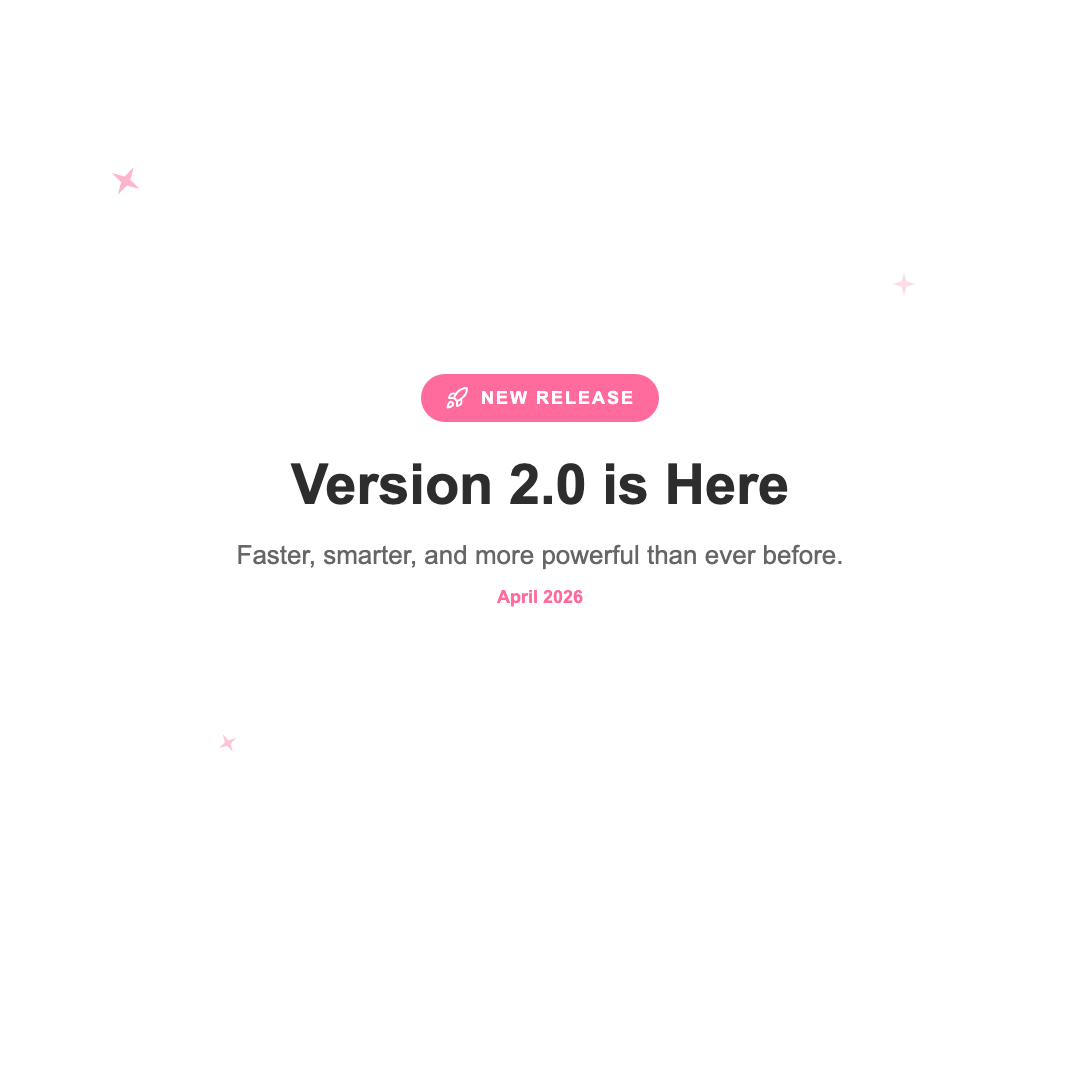
Announcement
15 variants
Archive
14 variants
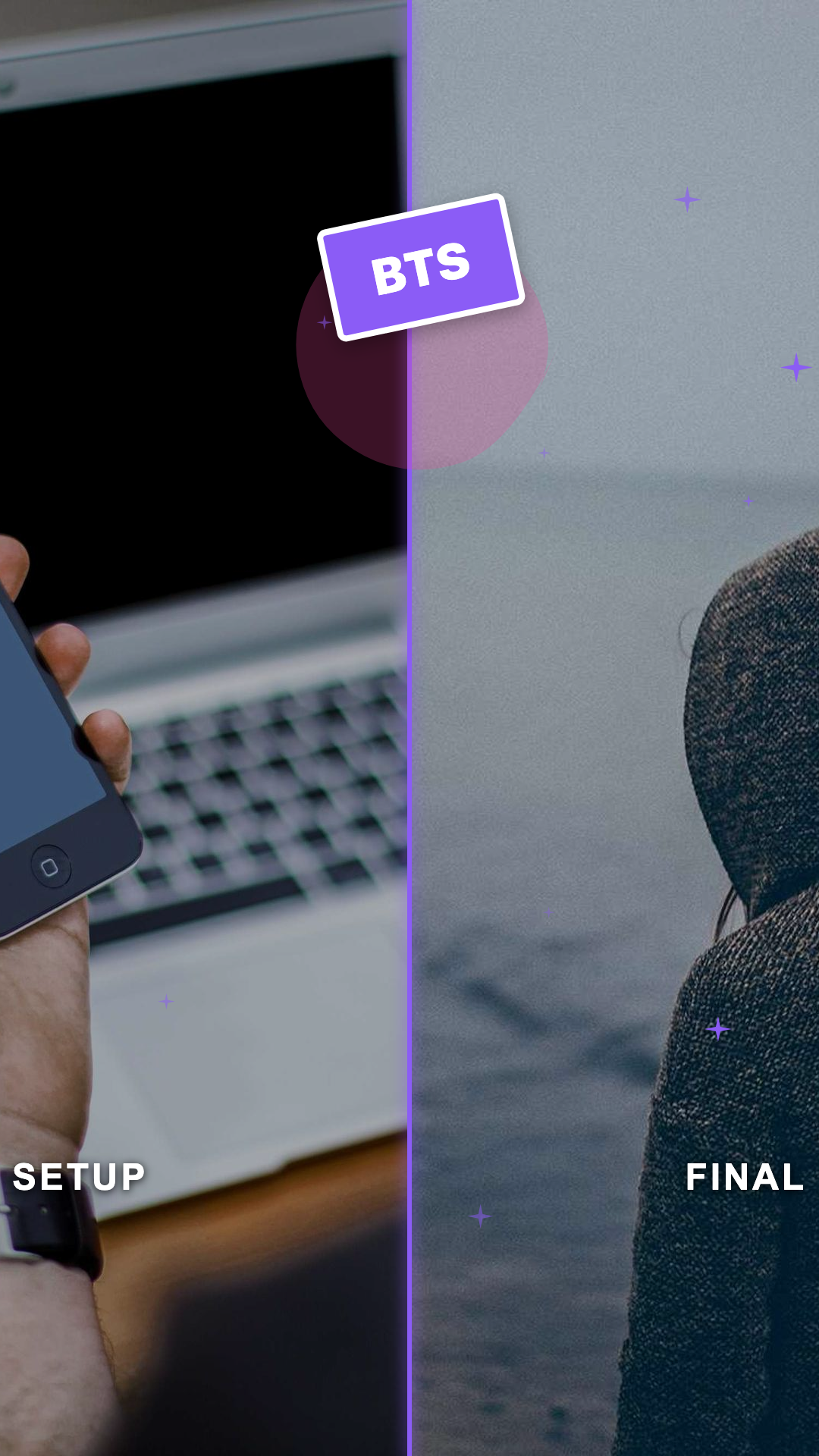
Before / After
16 variants
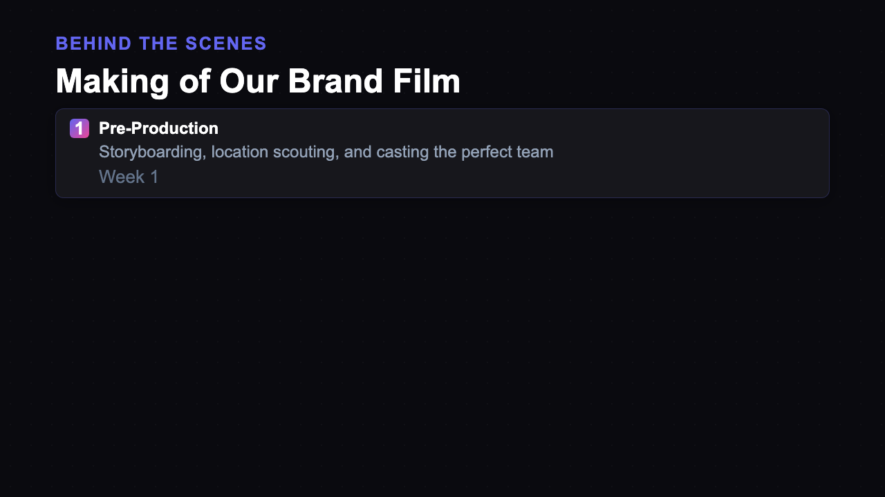
Behind The Scenes
16 variants
Bounce Text
16 variants
BTS Creator
2 variants
Bubble Pop Text
16 variants
Bug Tracker
16 variants
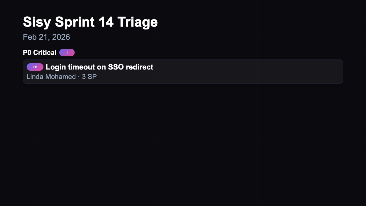
Bug Triage
16 variants
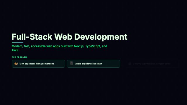
Call to Action
15 variants
Card Flip
16 variants
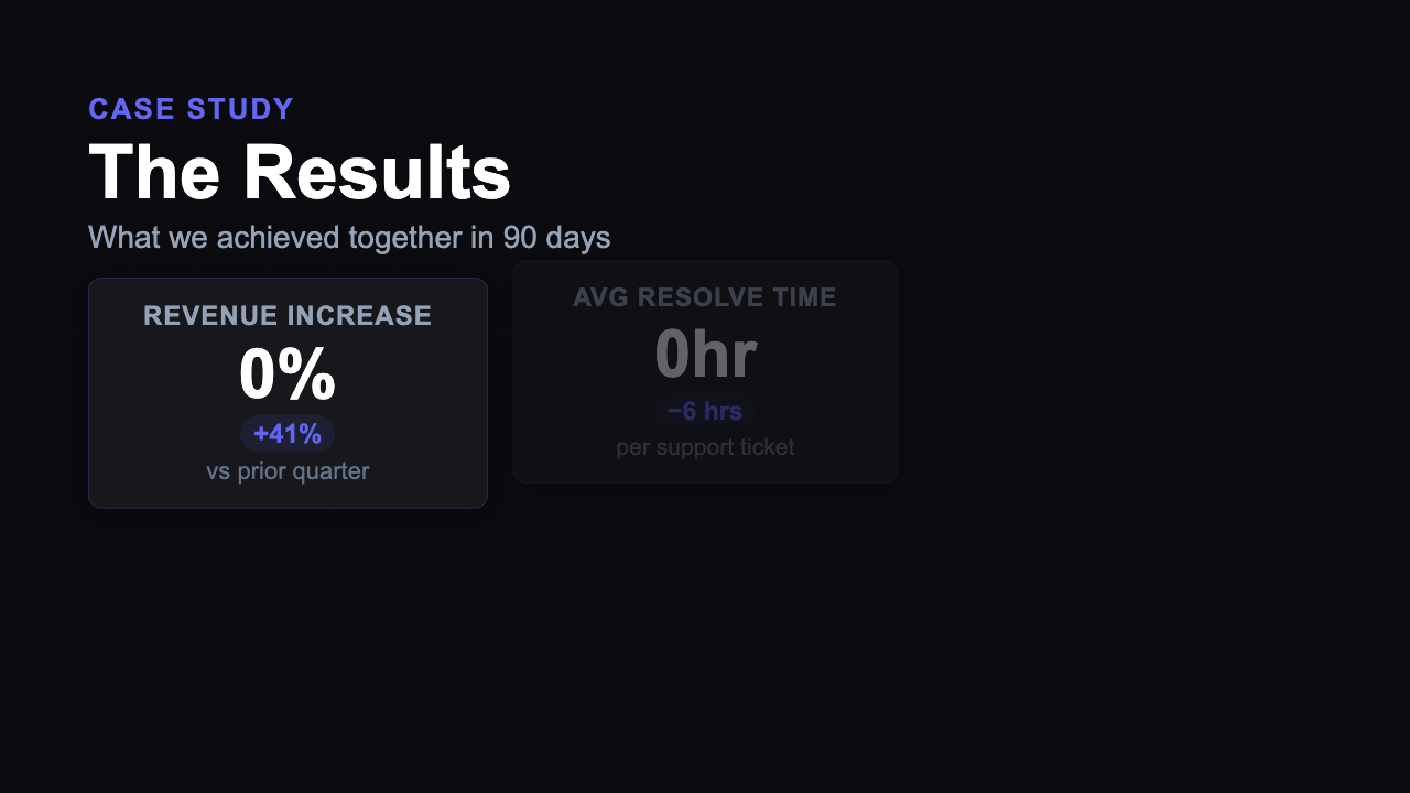
Case Study
16 variants
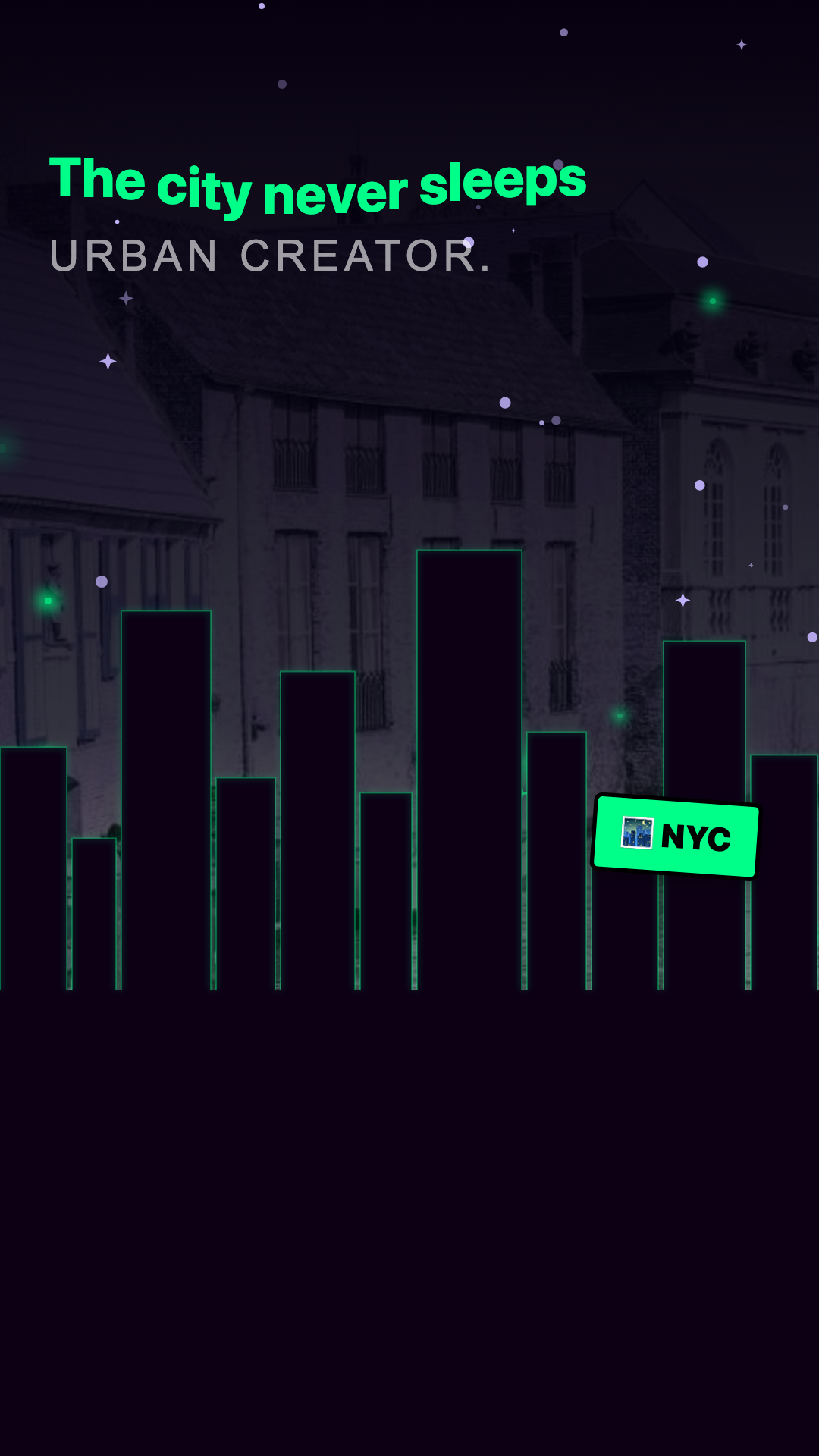
City Lights
2 variants
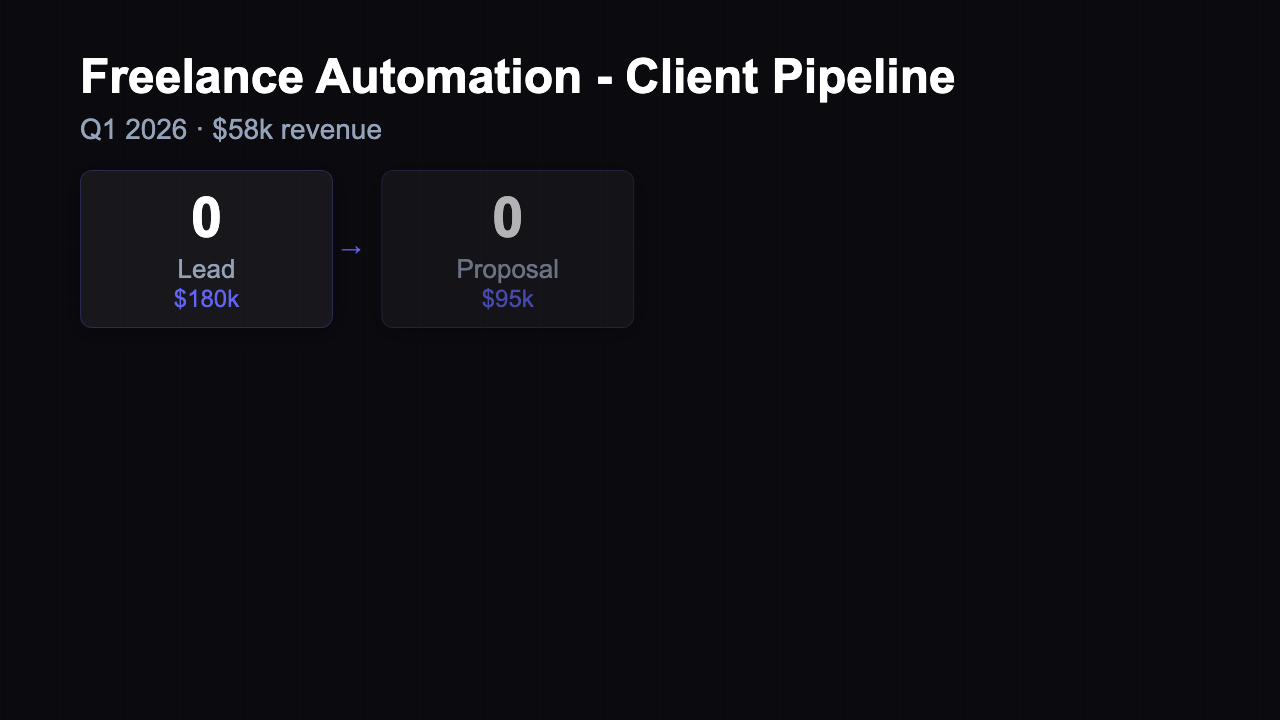
Client Pipeline
16 variants
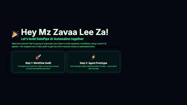
Client Welcome Deck
21 variants
Collaboration
16 variants
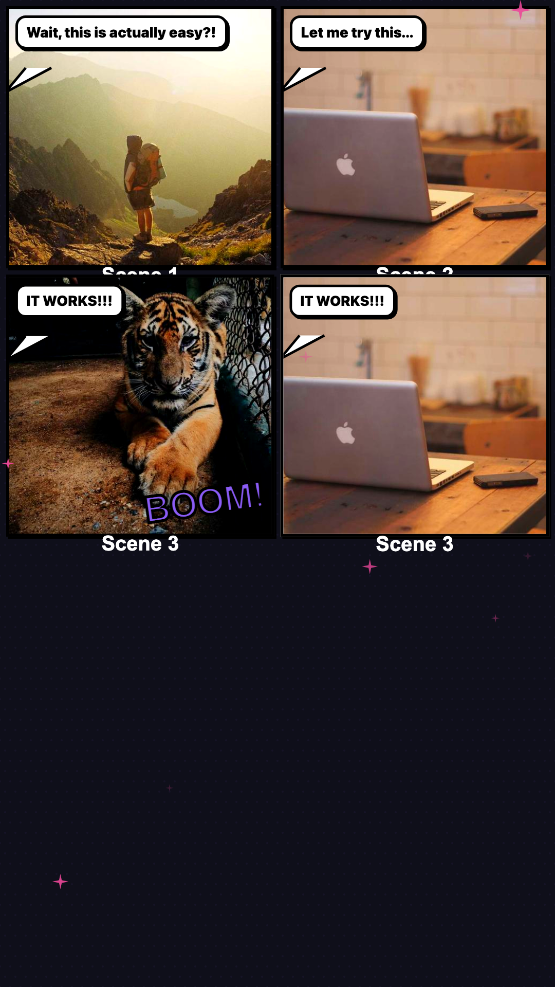
Comic Strip
2 variants
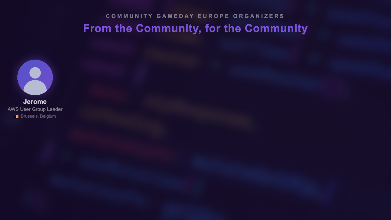
Community GameDay Europe
35 variants
Component Inventory
16 variants
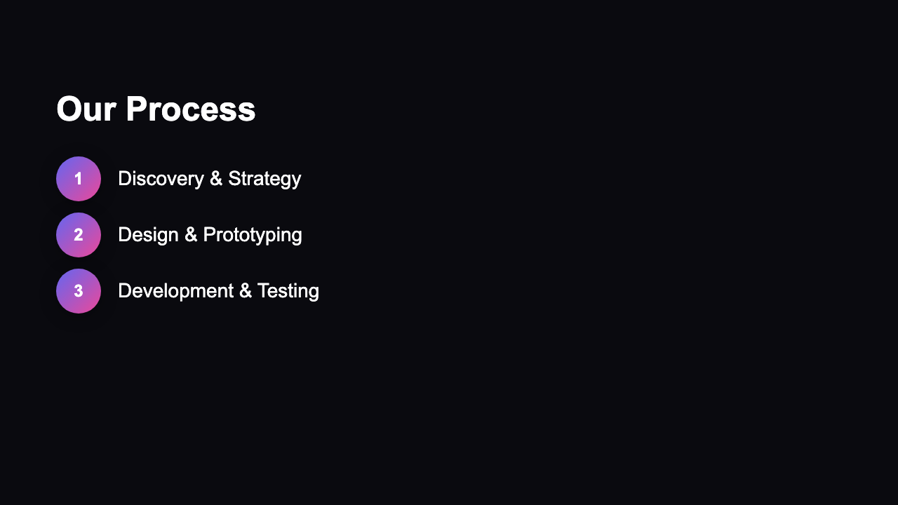
Concept Pitch
16 variants
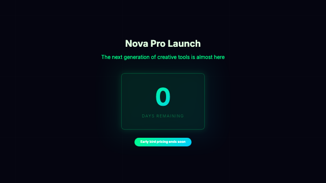
Countdown Hype
16 variants
Course Promo
16 variants

Creator Projects
4 variants
Creator Recap
2 variants
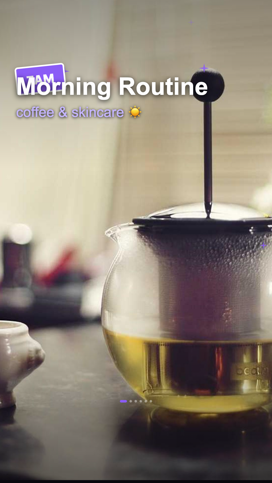
Day In The Life
2 variants
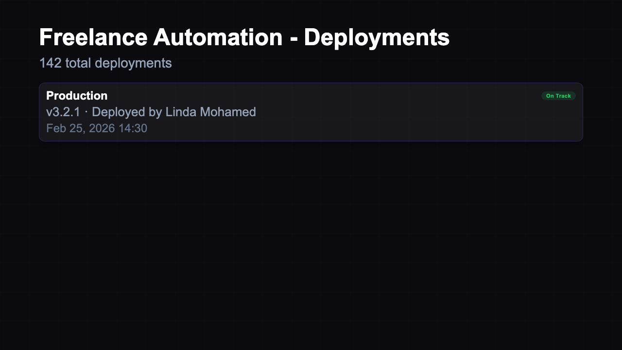
Deployment Status
16 variants
Effort Tracking
16 variants
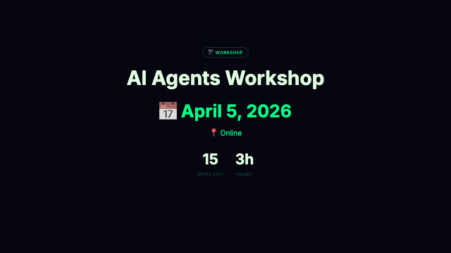
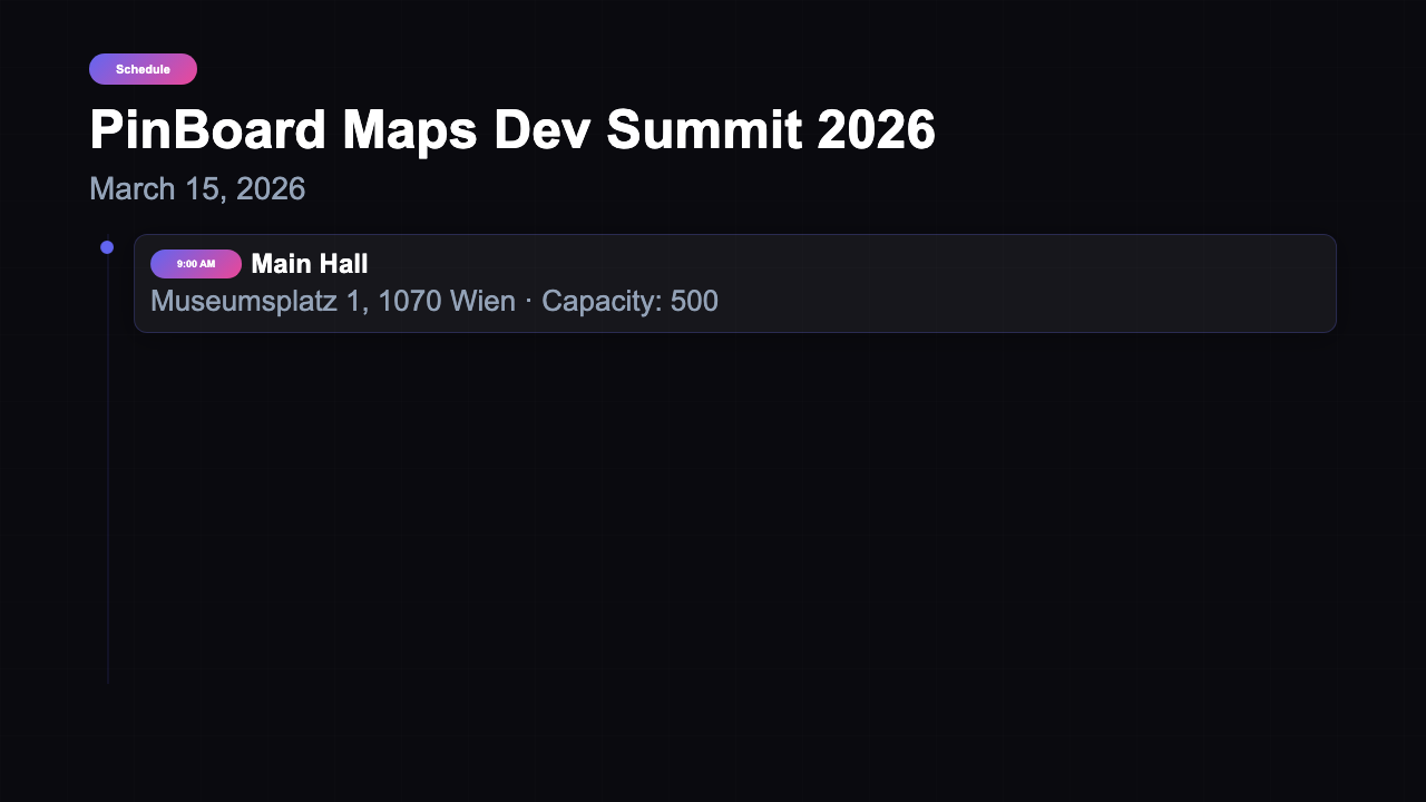
Event
16 variants
Event Venue
16 variants
Explainer
16 variants
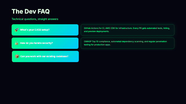
FAQ
16 variants
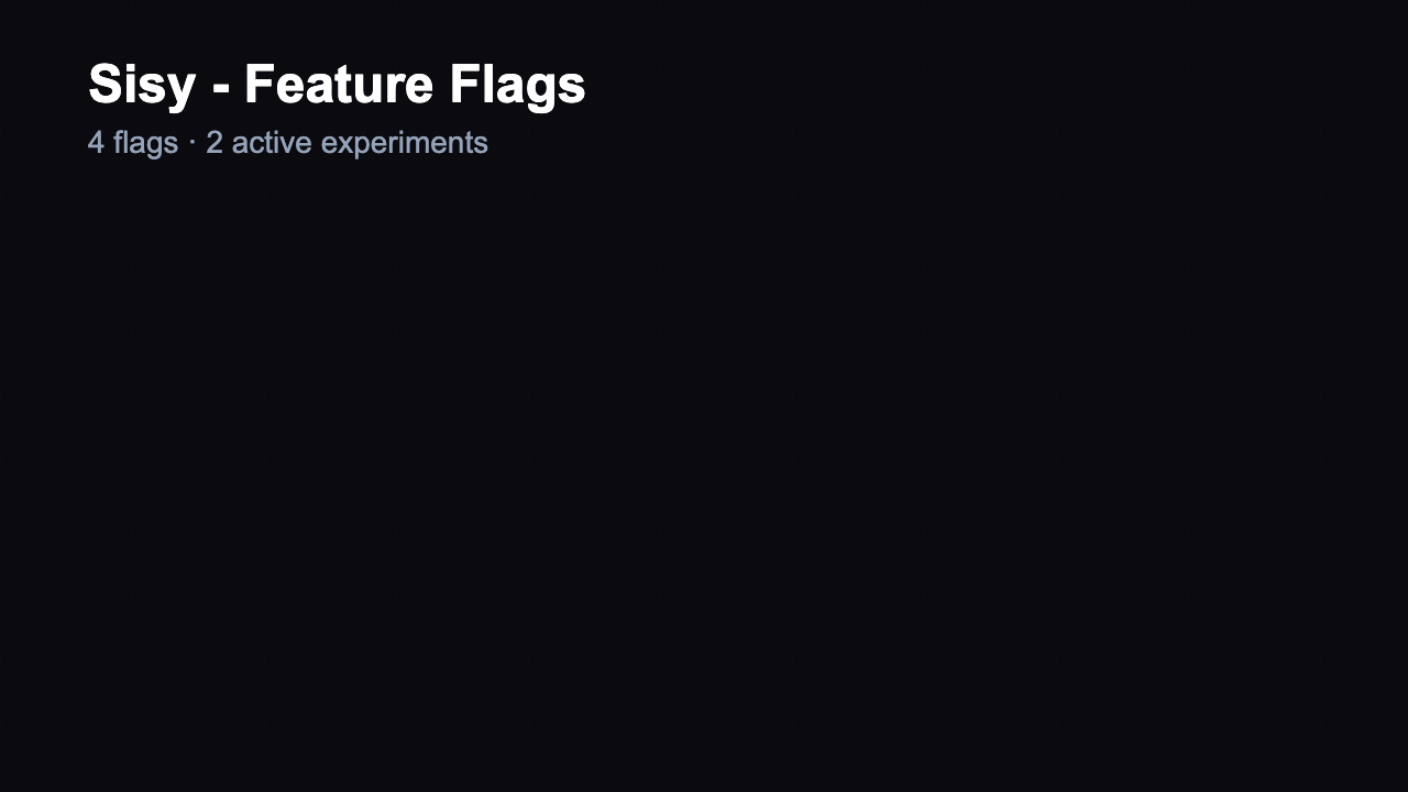
Feature Flags
16 variants
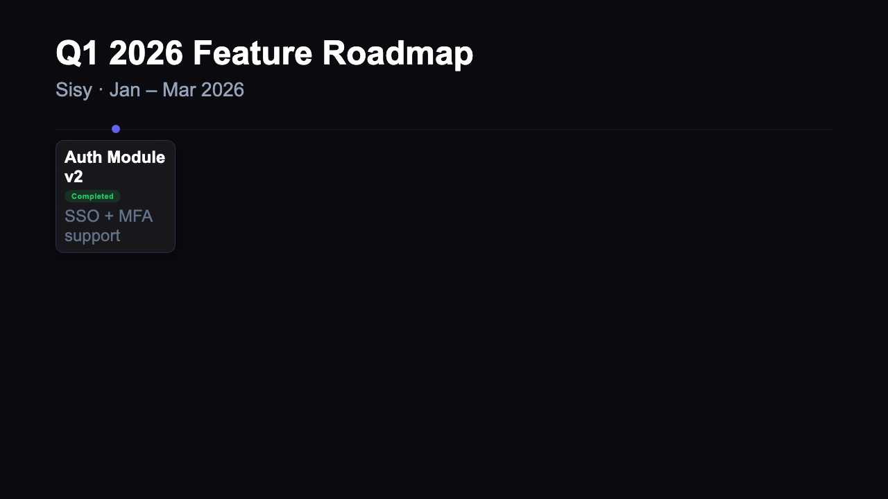
Feature Roadmap
16 variants
Festival Lineup
2 variants
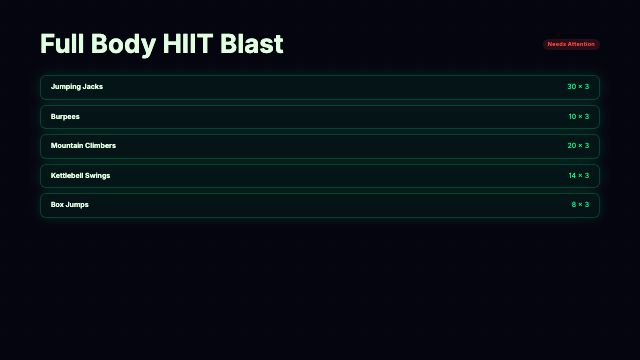
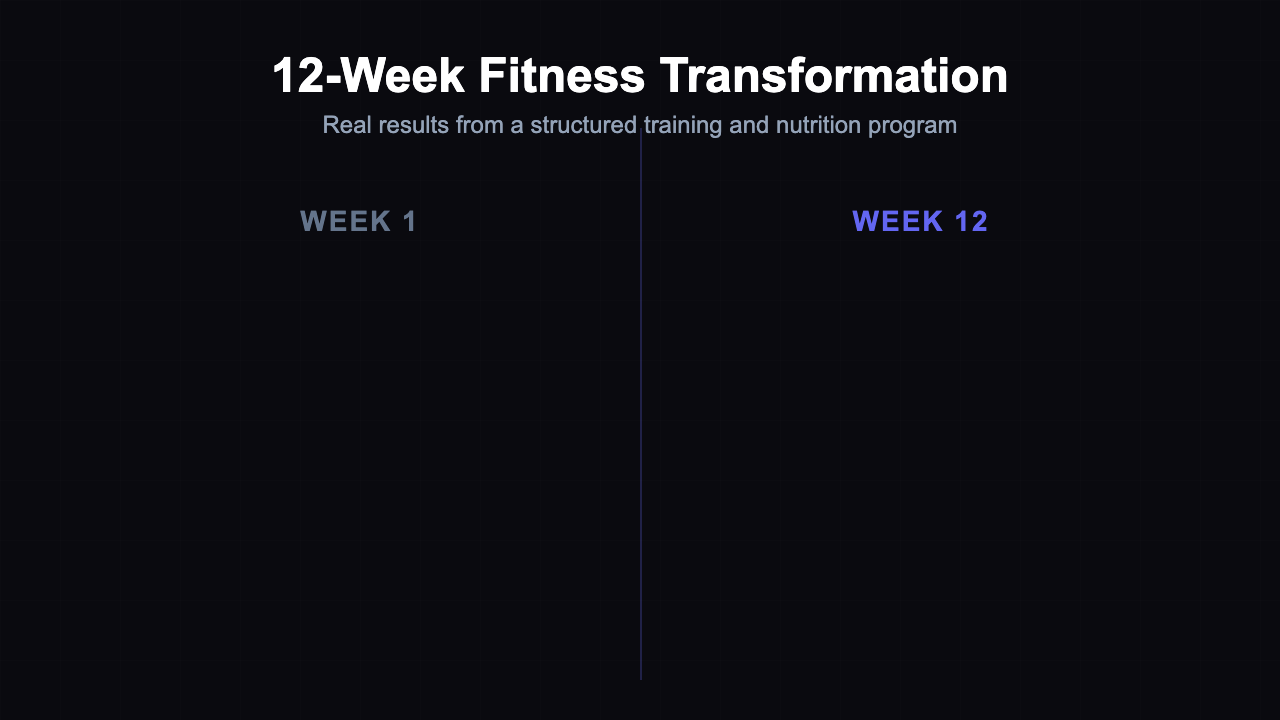
Fitness Routine
16 variants

Floating Bubble
16 variants
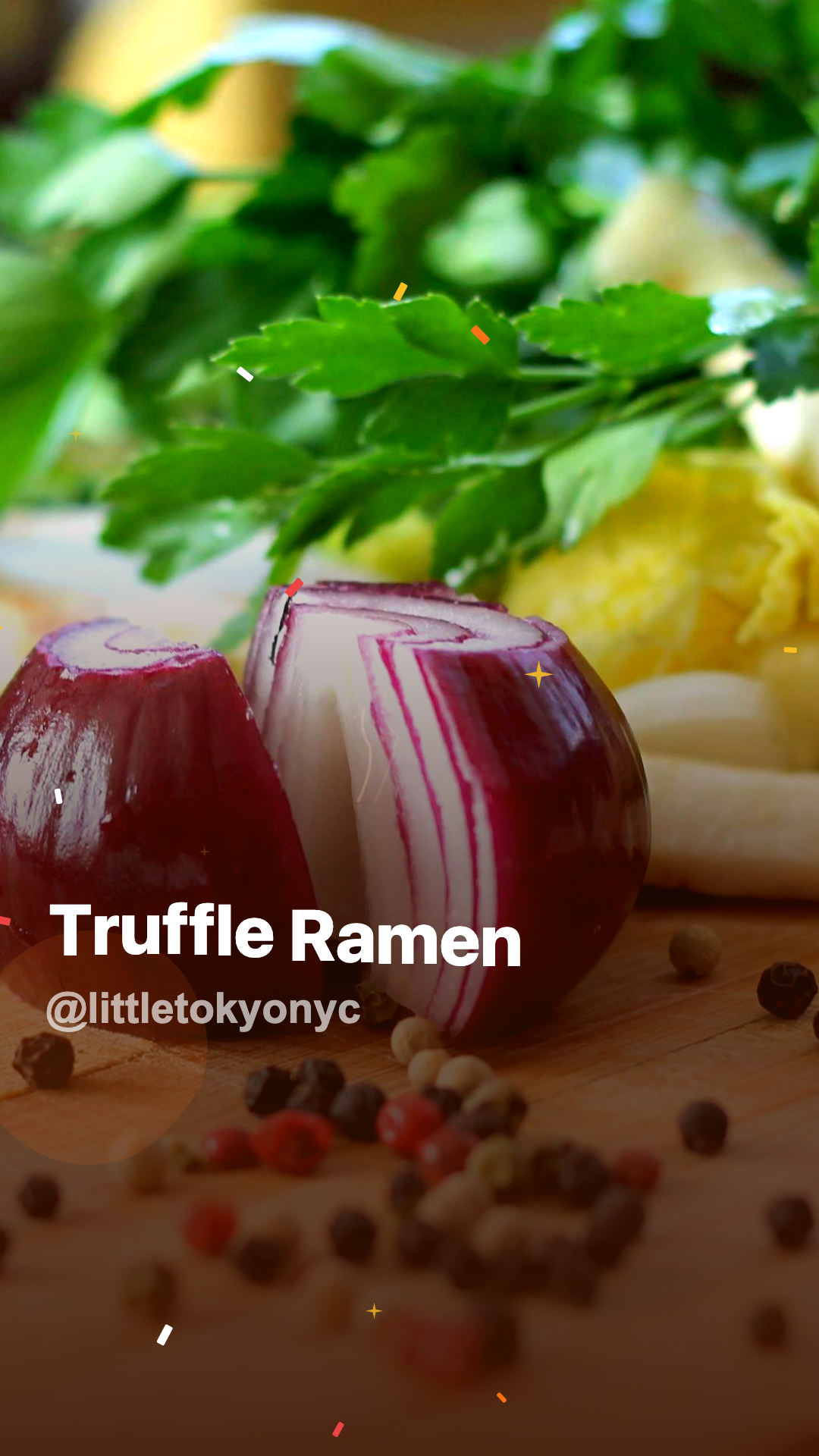
Foodie Reel
2 variants

GameDay Stream Overlays
4 variants
Geometric Patterns
16 variants
Glitch Text
16 variants

GRWM Reel
2 variants
Integration Status
16 variants
Invoice
16 variants

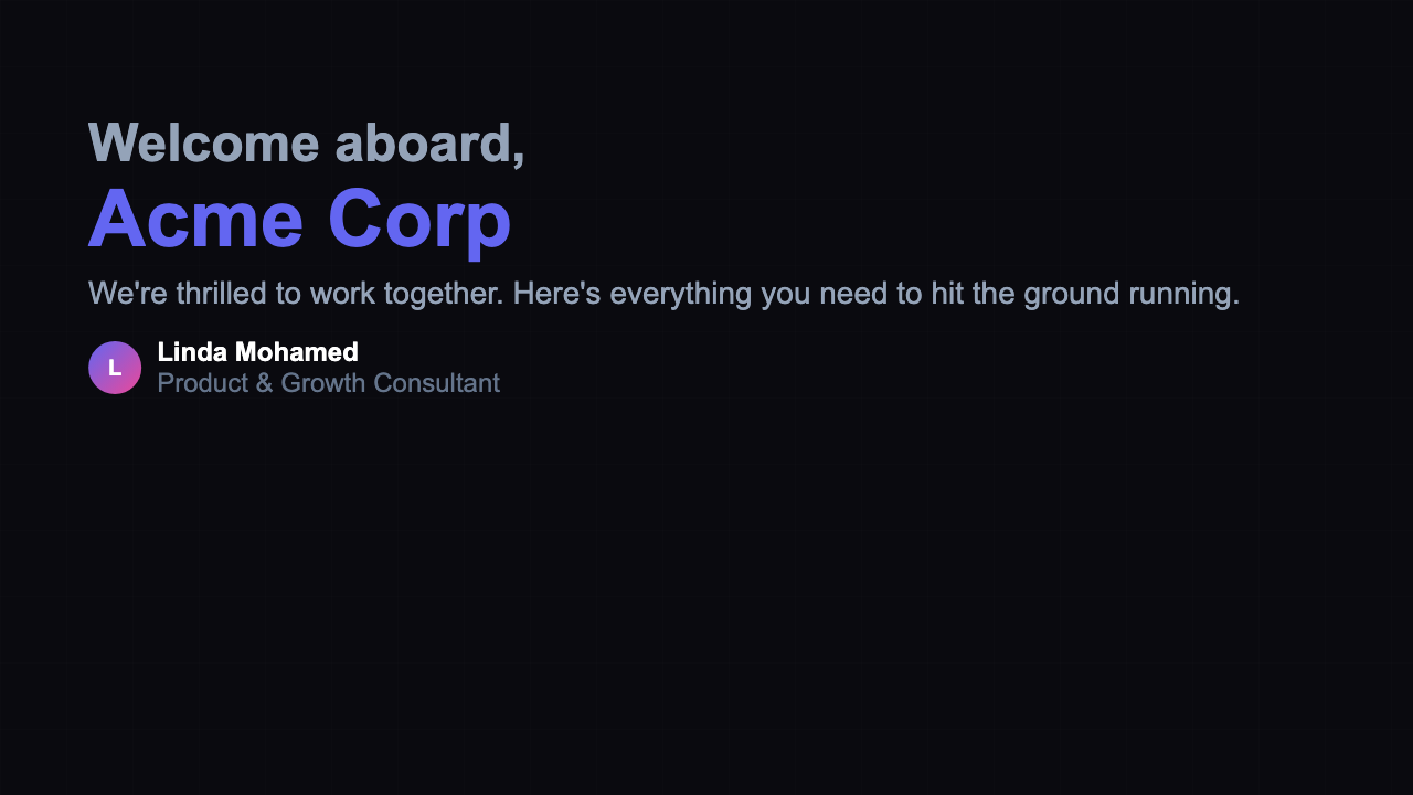
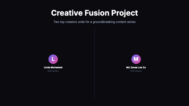
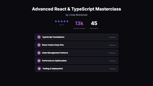
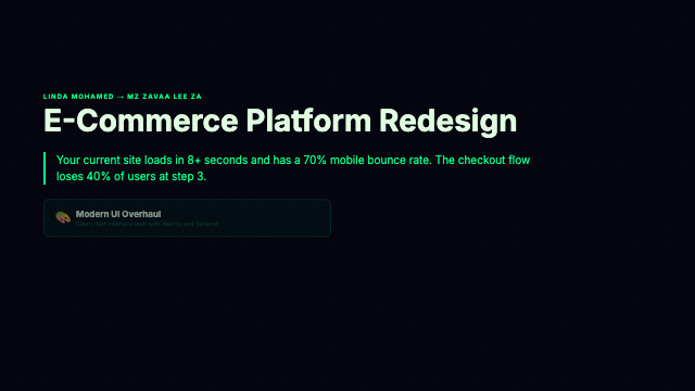
Linda Mohamed Deck
24 variants
Liquid Wave
16 variants

Listicle
15 variants
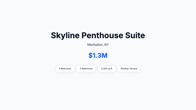
Listing
16 variants
Matrix Rain
16 variants
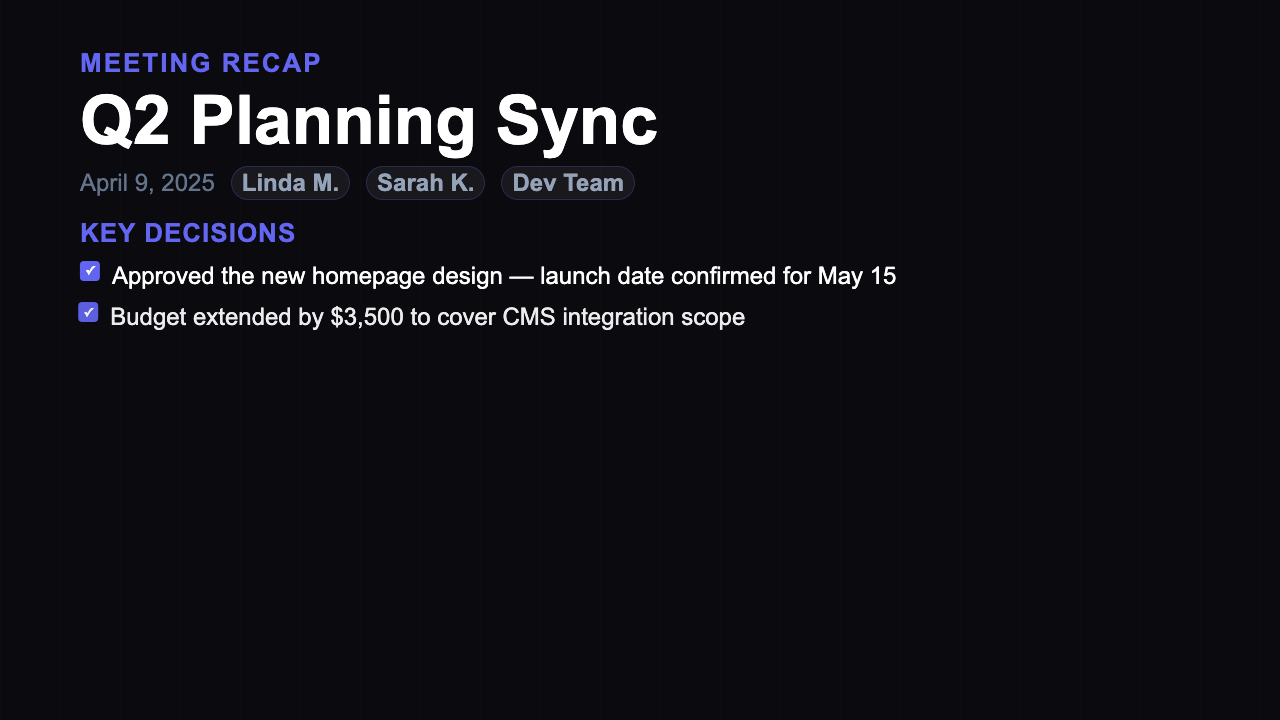
Meeting Recap
21 variants
Milestone
16 variants
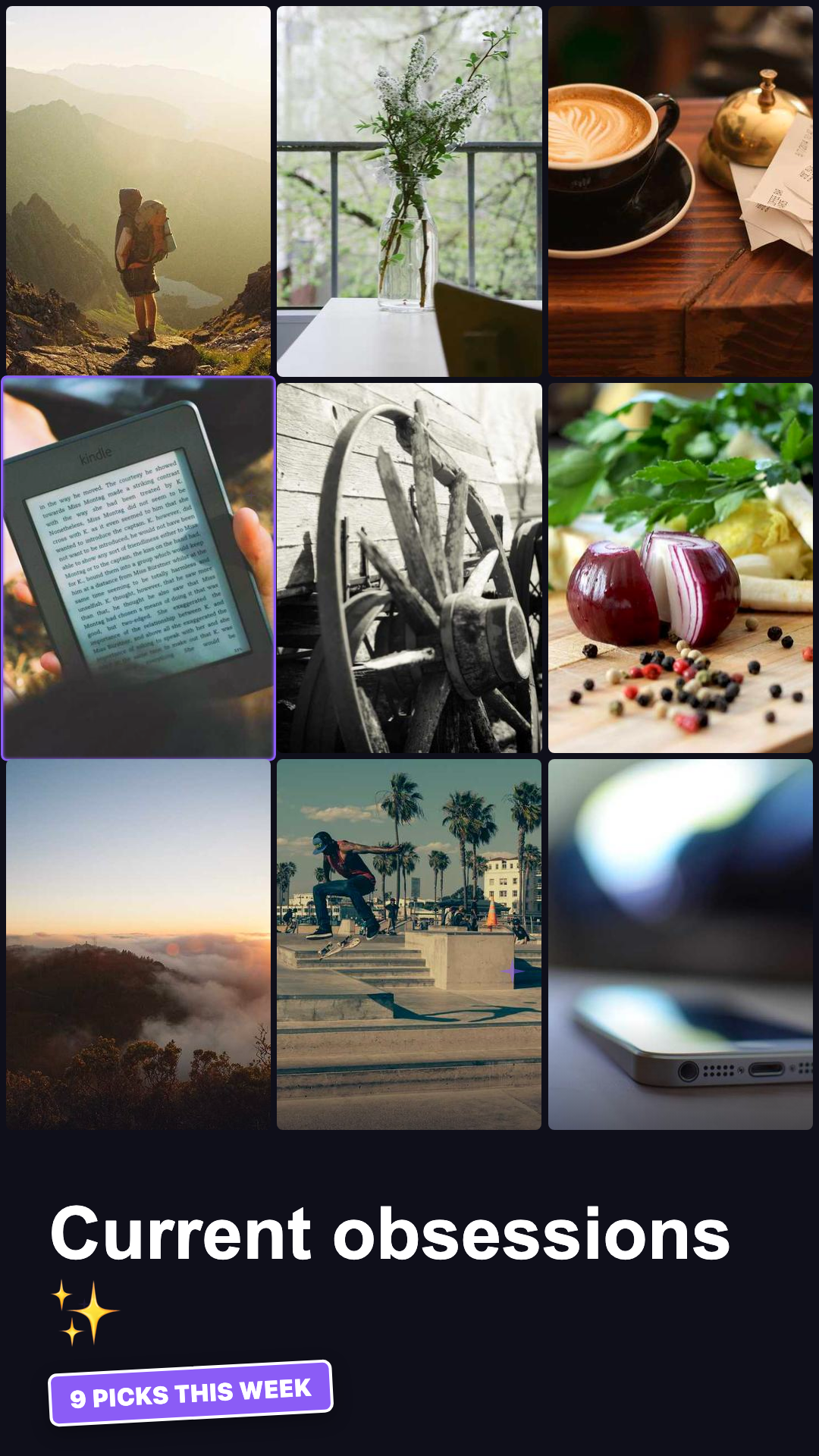
Mood Board
2 variants
Music Visualizer
16 variants

Nature Escape
2 variants
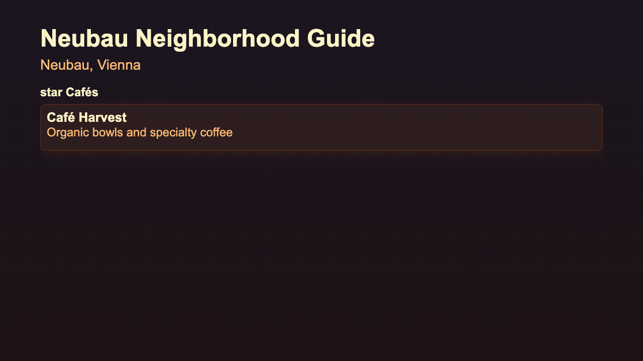
Neighborhood Guide
16 variants
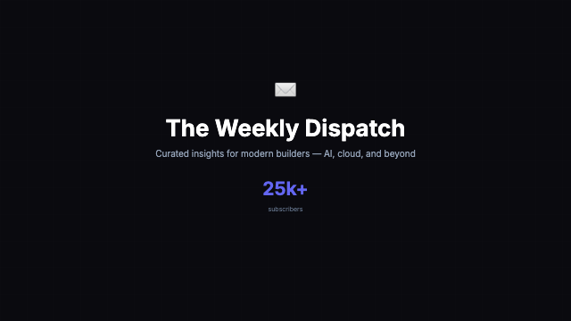
Newsletter Promo
16 variants
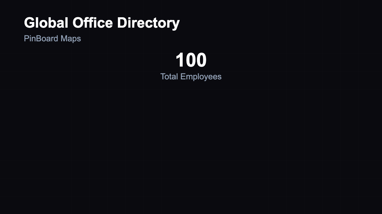
Office Directory
16 variants
Onboarding
16 variants
Outfit Reveal
2 variants
Particle Explosion
16 variants
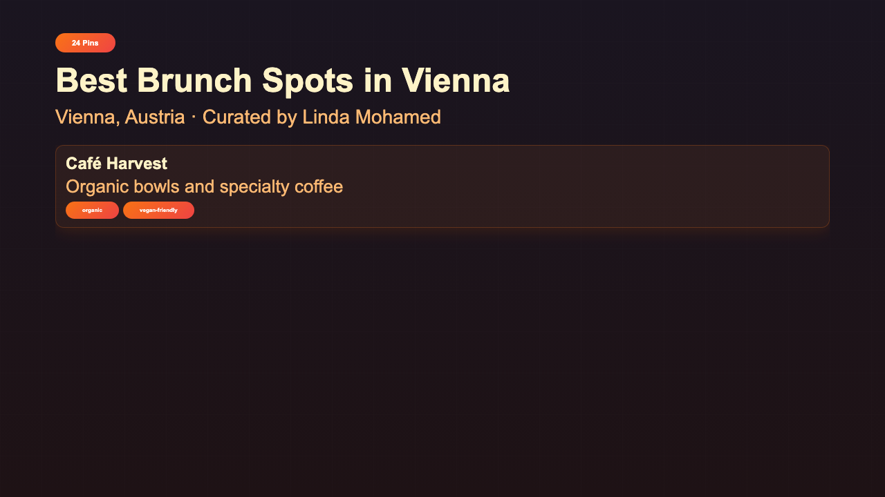
Pin Collection
16 variants
Platform Overview
16 variants
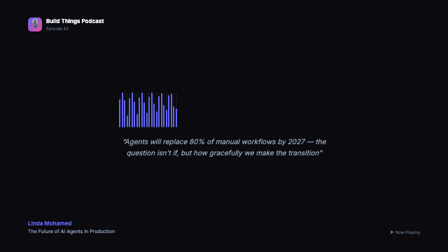
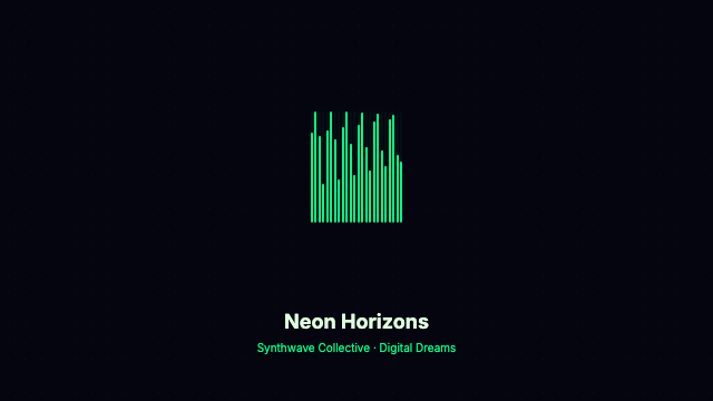
Podcast Audiogram
16 variants
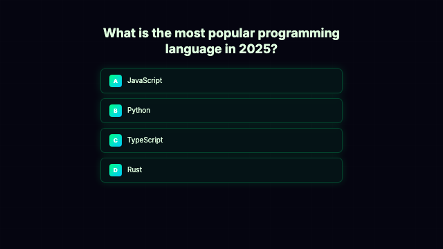
Poll / Quiz
16 variants
Portfolio
16 variants
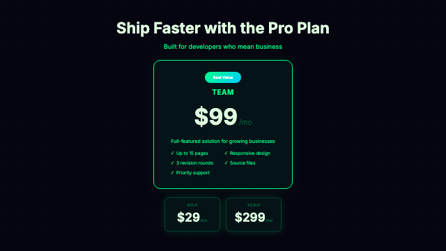
Pricing
16 variants
Product Launch
16 variants

Product Reveal
2 variants
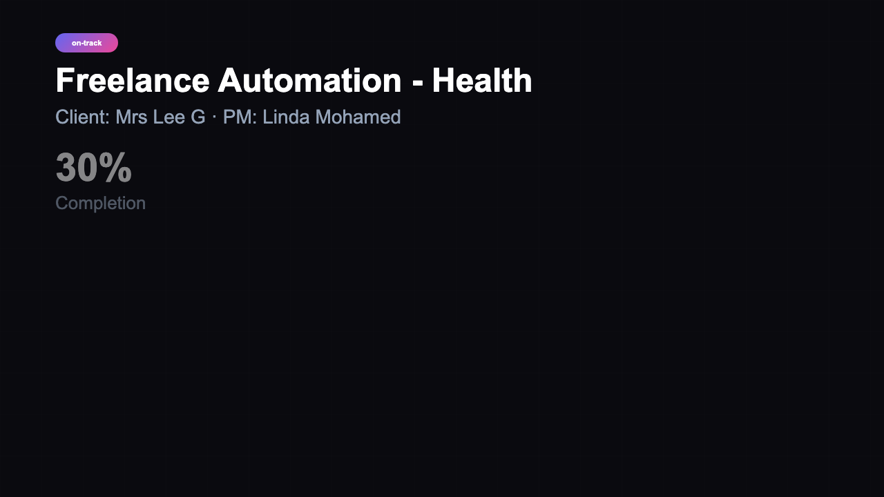
Project Health
16 variants
Project Proposal
16 variants
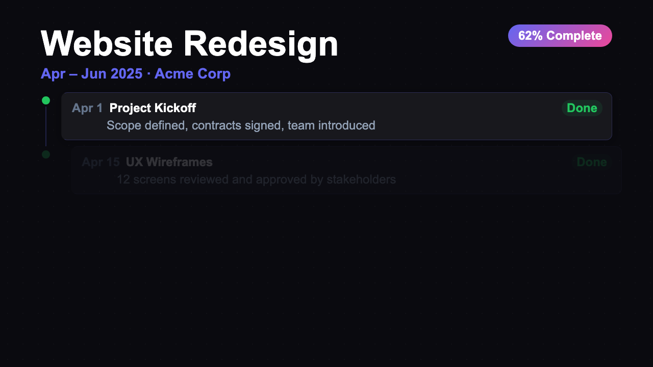
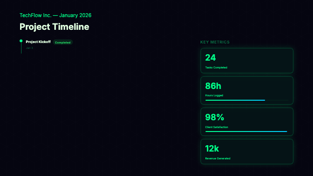
Project Timeline
21 variants
Pulsing Text
16 variants
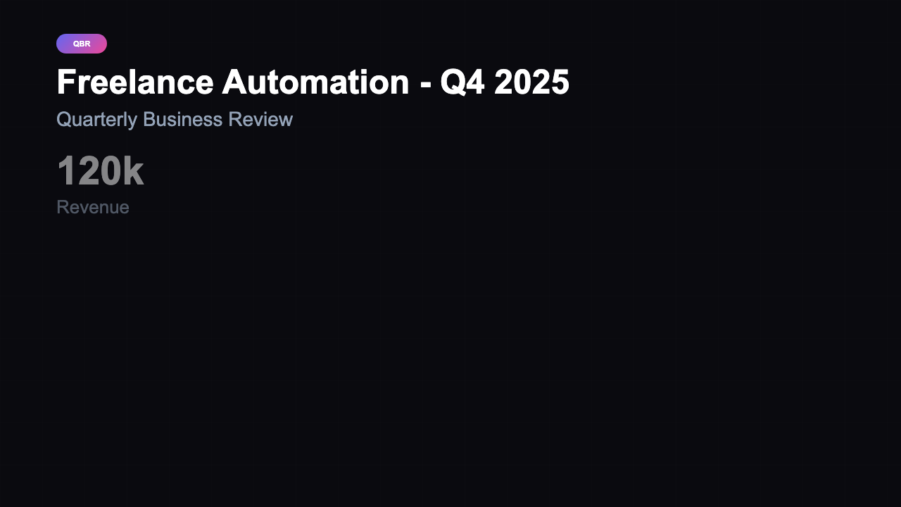
QBR Dashboard
16 variants
Quote Card
14 variants
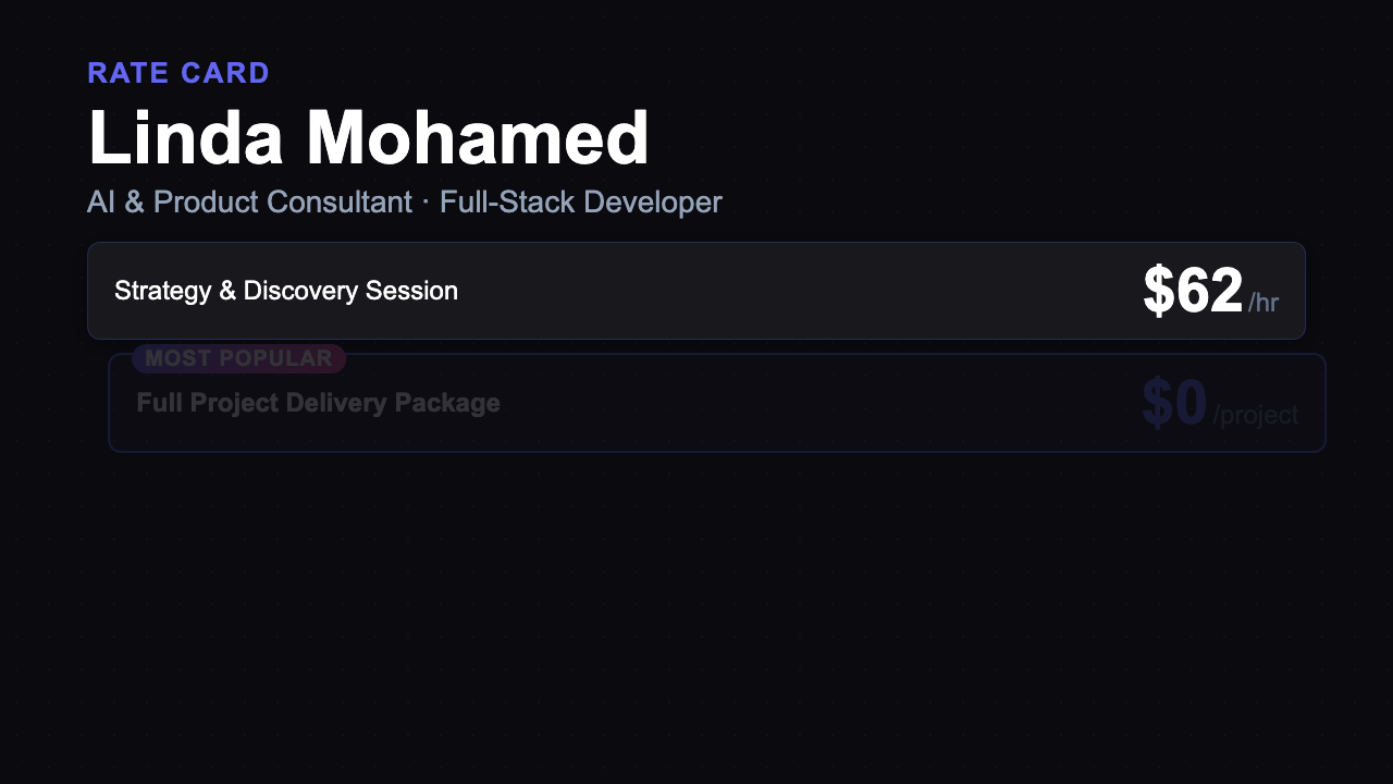
Rate Card
21 variants
Recap
16 variants
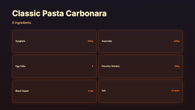
Recipe Step
16 variants
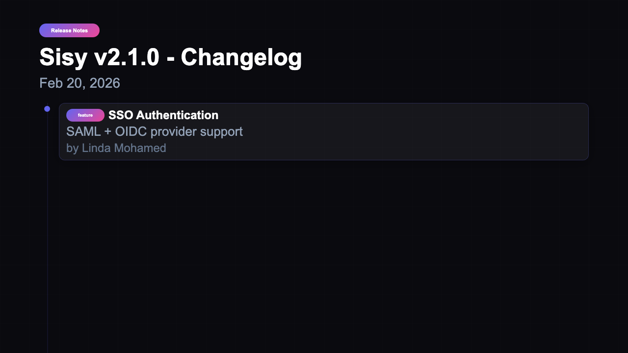
Release Notes
16 variants
Results Showcase
21 variants
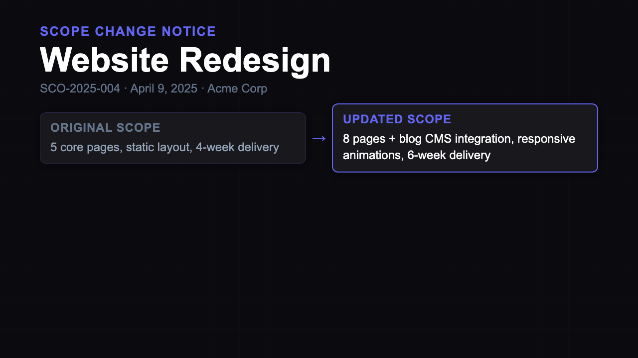
Scope Change Request
21 variants

Screencast Slideshow
17 variants
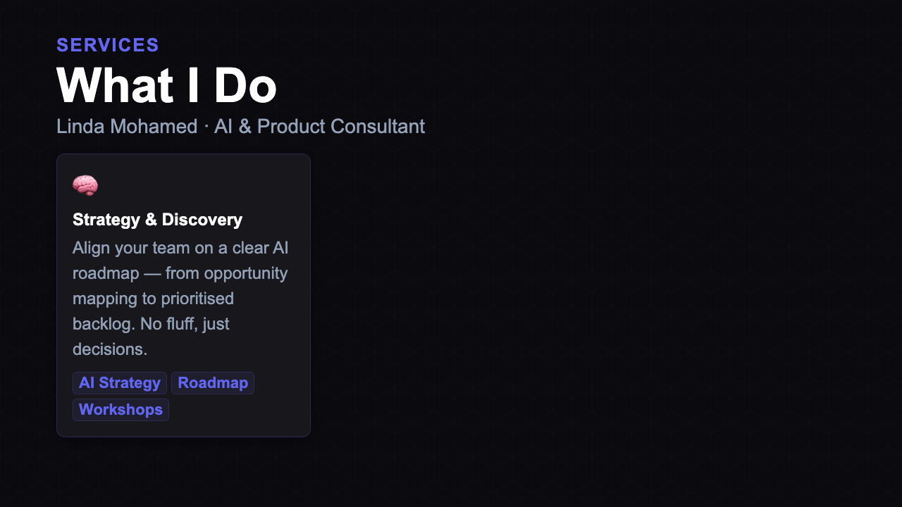
Service Overview
21 variants
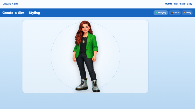
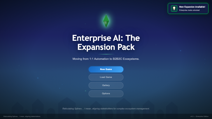
Sims 4 Theme
4 variants
Slide Text
16 variants
Social Proof
16 variants
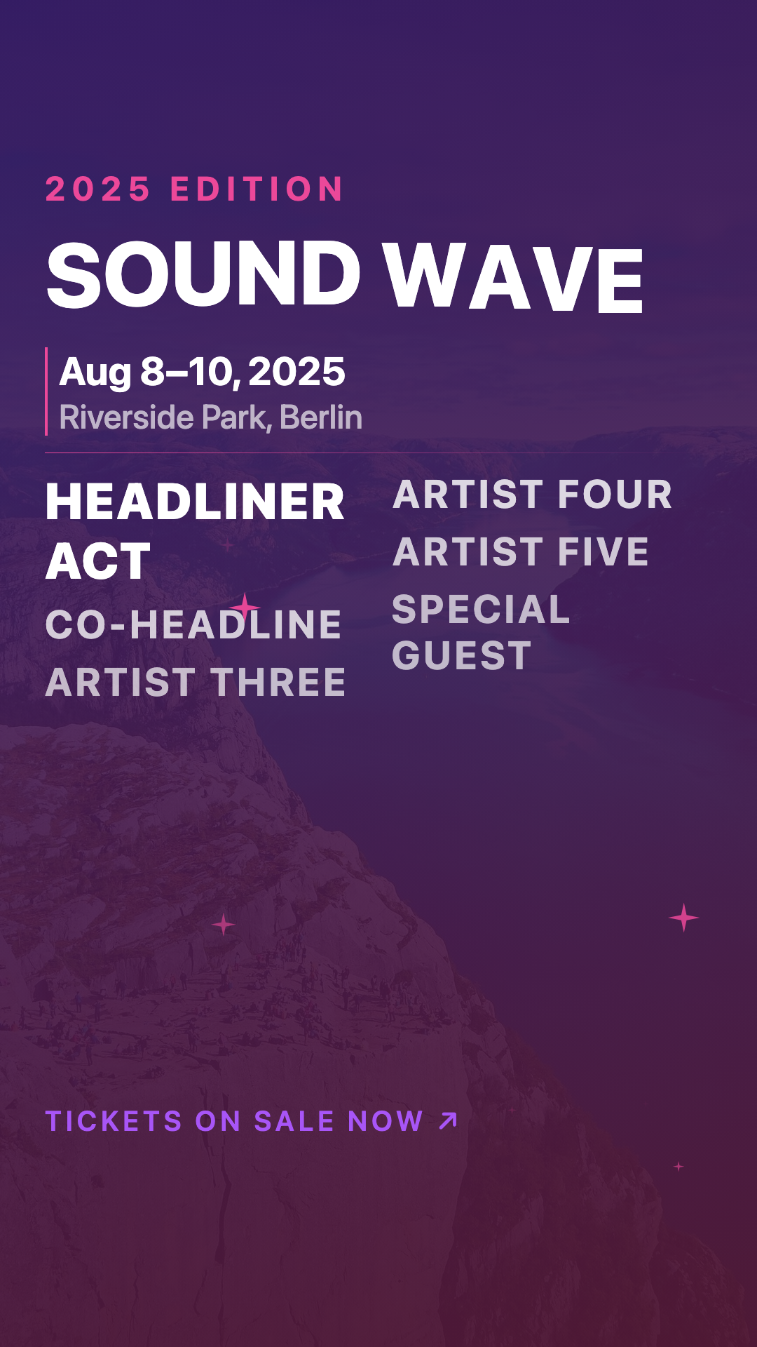
Sound Wave
16 variants
Sprint Dashboard
16 variants
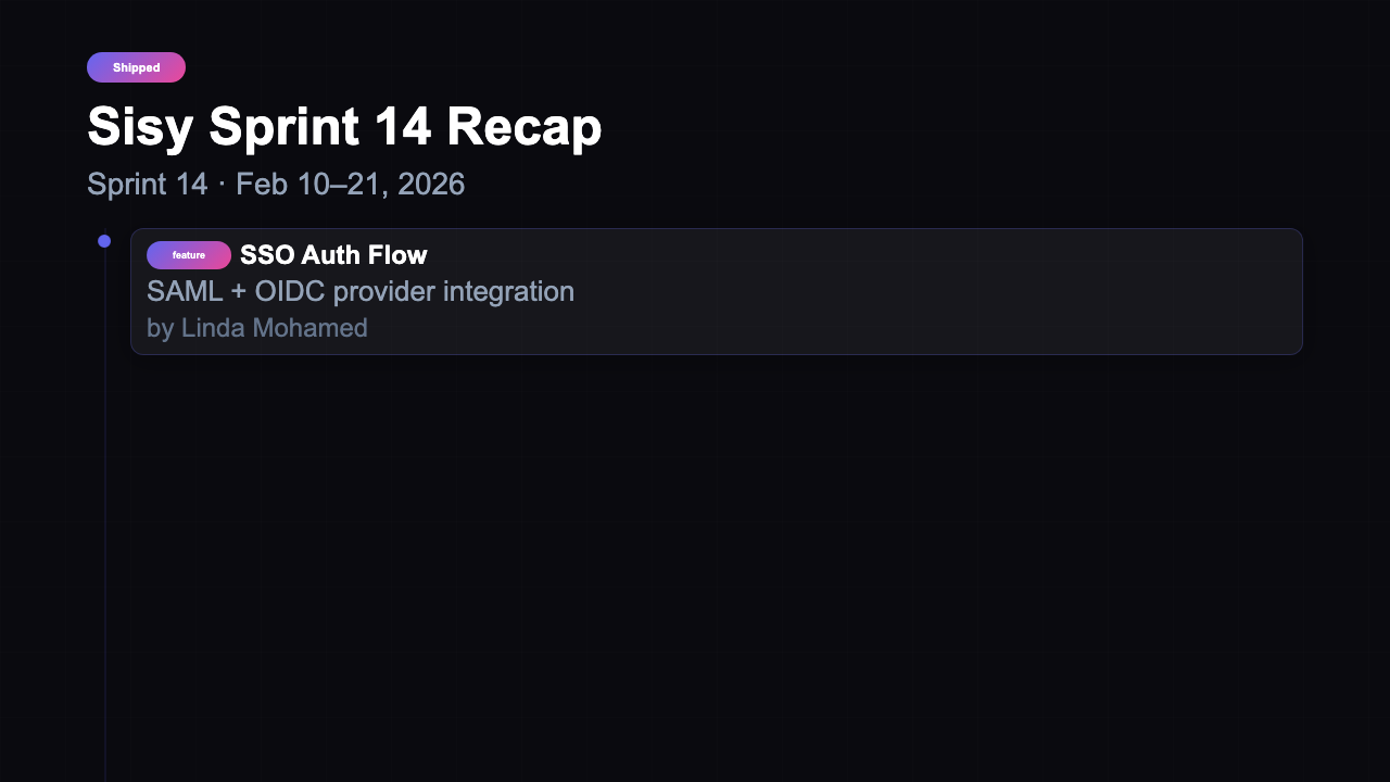
Sprint Recap
16 variants
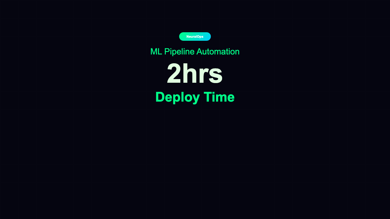
Stat Counter
15 variants
Store Locator
16 variants
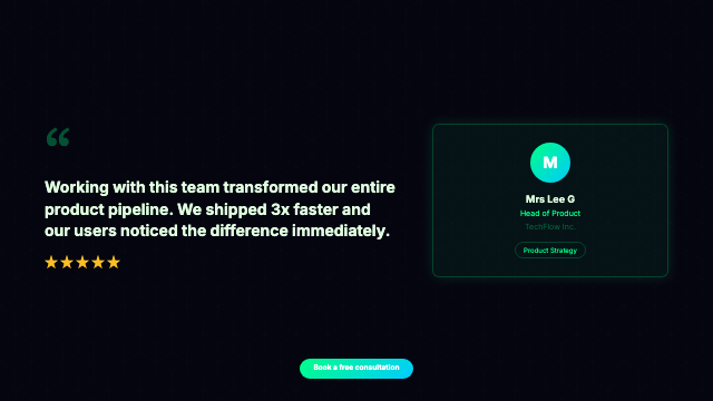
Testimonial
126 variants
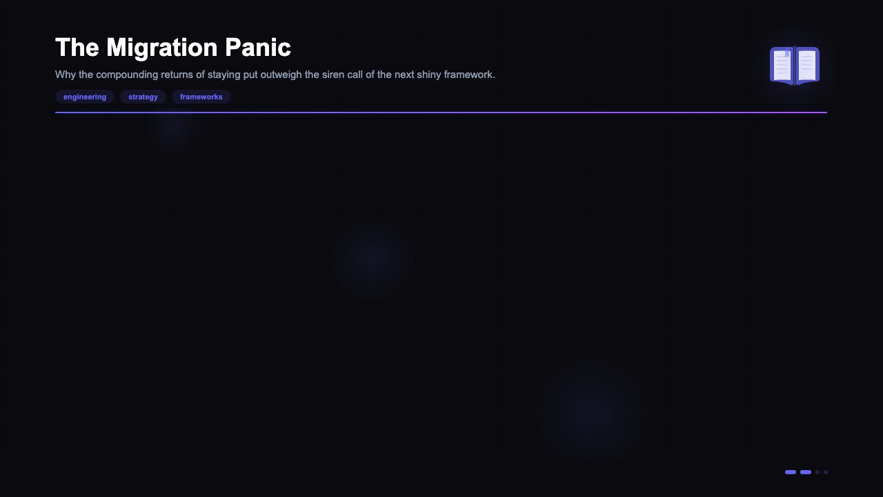
Thought Leadership
16 variants
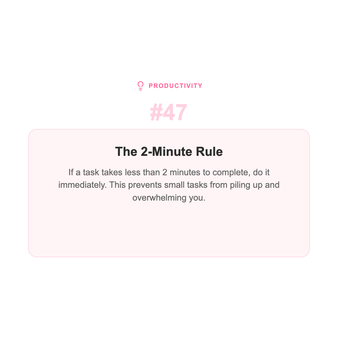
Tip of the Day
15 variants
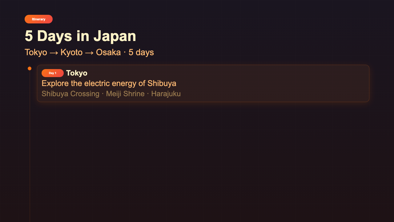
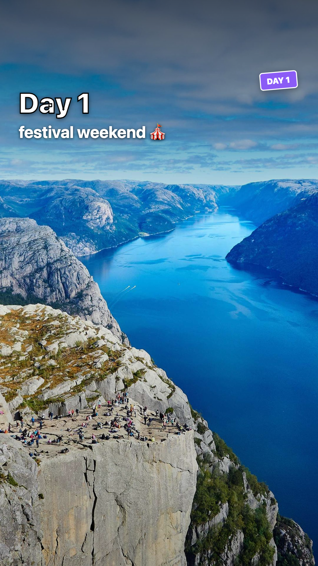
Travel Itinerary
16 variants

Travel Montage
2 variants
Tutorial
16 variants
Typewriter Subtitle
16 variants
Unboxing Moment
2 variants
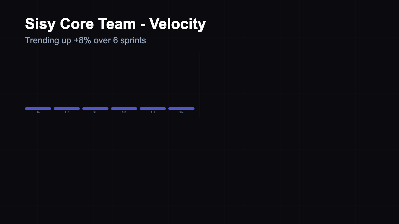
Velocity Chart
16 variants

Video Template Library
variants
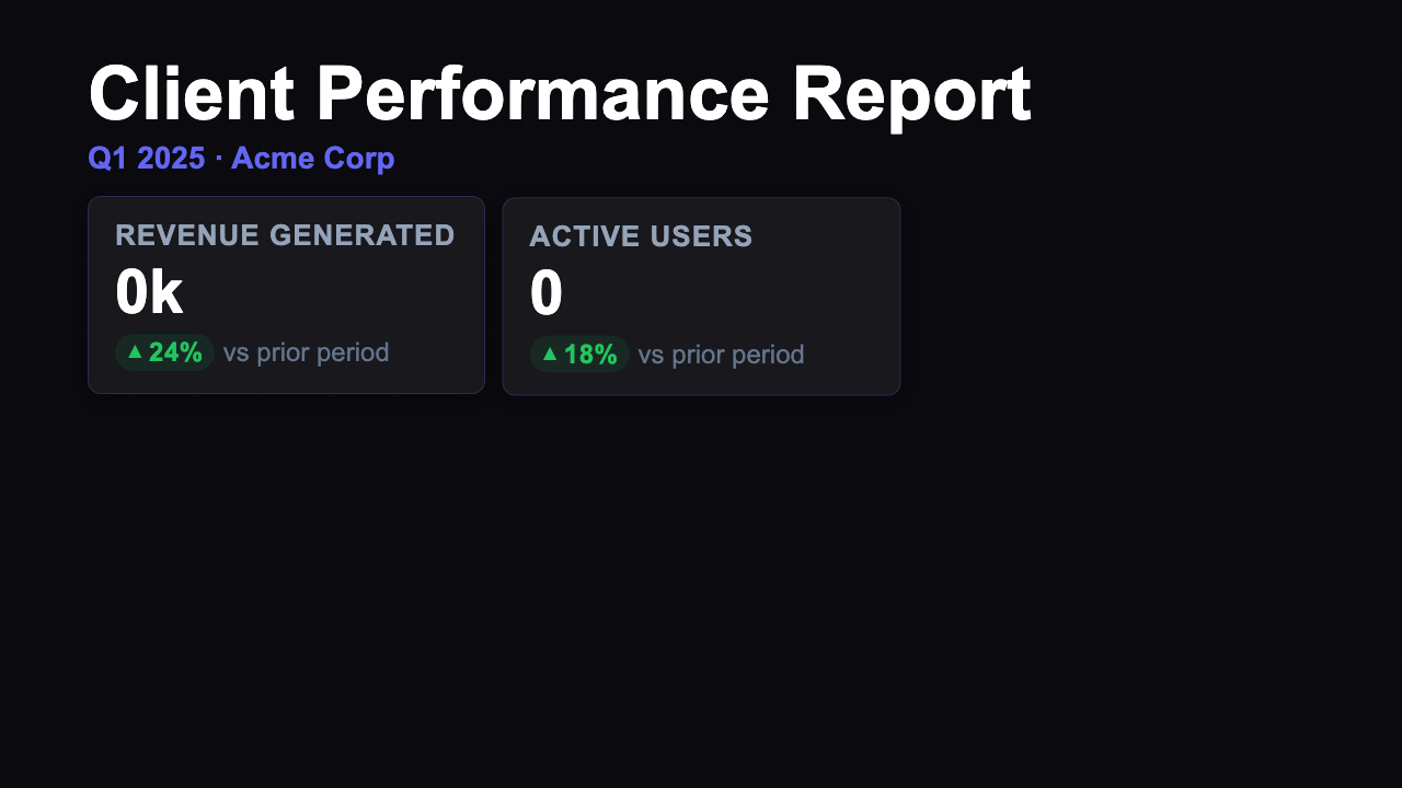
Weekly Client Report
21 variants
YouTube Tutorial
2 variants