All 16 style variants
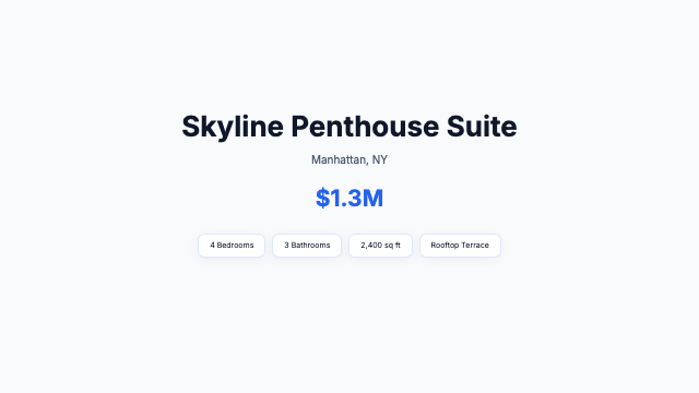
clean
Clean Showcase
Listing-CleanShowcase
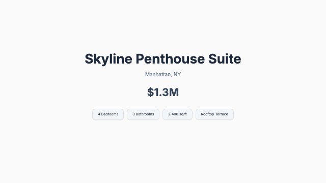
minimal
Minimal Showcase
Listing-MinimalShowcase
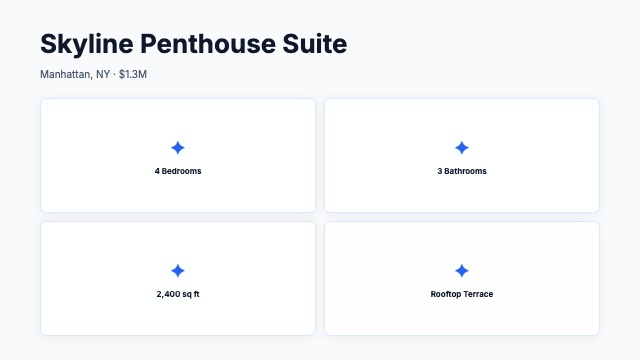
clean
Clean Feature Grid
Listing-CleanFeatureGrid
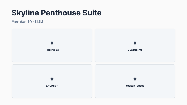
minimal
Minimal Feature Grid
Listing-MinimalFeatureGrid
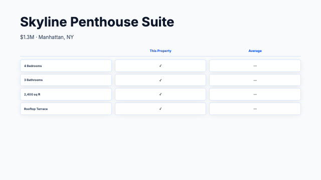
clean
Clean Comparison
Listing-CleanComparison
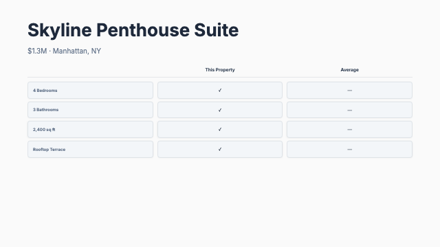
minimal
Minimal Comparison
Listing-MinimalComparison

ocean
Ocean Showcase
ListingOcean-Showcase

sunset
Sunset Showcase
ListingSunset-Showcase

forest
Forest Feature Grid
ListingForestFeature-Grid

rose
Rose Feature Grid
ListingRoseFeature-Grid

gold
Gold Comparison
ListingGold-Comparison

midnight
Midnight Comparison
ListingMidnight-Comparison

crimson
Crimson Showcase
ListingCrimson-Showcase

lavender
Lavender Showcase
ListingLavender-Showcase

arctic
Arctic Feature Grid
ListingArcticFeature-Grid

espresso
Espresso Feature Grid
ListingEspressoFeature-Grid