Back to library

Product Launch

Launch products with dramatic feature reveals, countdown teasers, and hero announcement sequences. Designed to generate pre-launch buzz and day-of excitement.

16 style variants Remotion composition CC-BY-NC-SA

Use across a multi-day launch sequence: start with teaser, then countdown, then hero reveal on launch day.

Use cases

  • SaaS product launch day announcements
  • Physical product drop reveals
  • App launch hype reels
  • Feature update announcements

What you get

  • Hero Reveal - dramatic full-screen product name reveal
  • Feature Grid - animated feature highlight cards
  • Countdown - launch date countdown with teaser copy

Click a variant below to switch the preview. Use arrow keys in the full player to step through all compositions.

Customize brand colors

Adjust colors below to see this template in your brand. Changes are saved in the URL so you can share or bookmark.

Backgrounds
Page
#0a0a0f
Card / Section
#111827
Text
Heading (h1/h2)
#ffffff
Subheading (h3)
#cbd5e1
Paragraph
#e2e8f0
Muted / Caption
#64748b
Accents & Borders
Primary
#6366f1
Secondary
#a855f7
Border
#1e293b
Upload logo / CSS My Brands

Saved designs and brands appear in My Brands. All data stays in your browser. Privacy policy

All 16 style variants

Product Launch - Dark Hero Reveal
dark
Dark Hero Reveal
ProductLaunch-DarkHeroReveal
Product Launch - Bold Hero Reveal
bold
Bold Hero Reveal
ProductLaunch-BoldHeroReveal
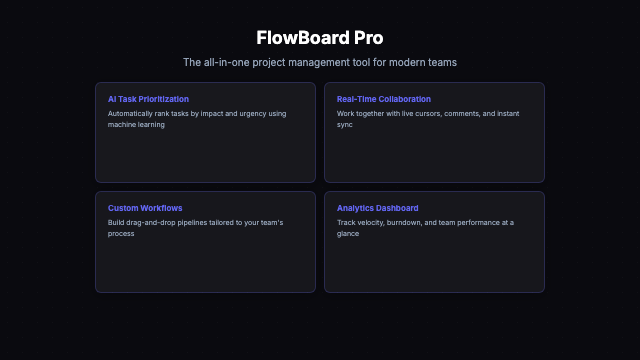
Product Launch - Dark Feature Grid
dark
Dark Feature Grid
ProductLaunch-DarkFeatureGrid
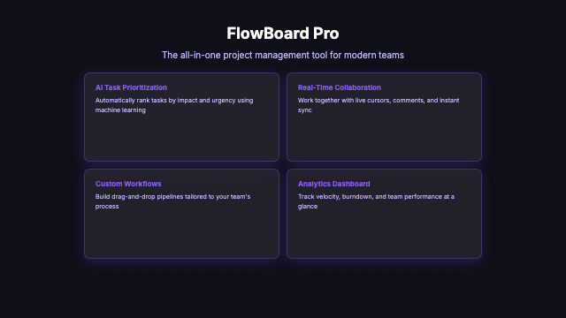
Product Launch - Bold Feature Grid
bold
Bold Feature Grid
ProductLaunch-BoldFeatureGrid
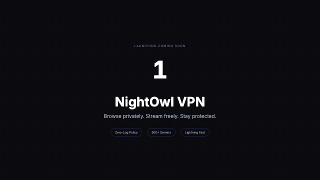
Product Launch - Dark Countdown
dark
Dark Countdown
ProductLaunch-DarkCountdown
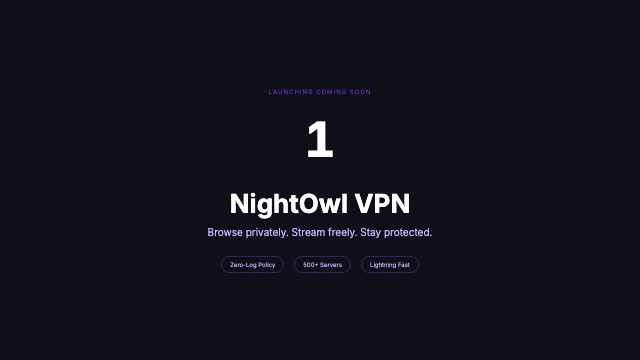
Product Launch - Bold Countdown
bold
Bold Countdown
ProductLaunch-BoldCountdown
Product Launch - Ocean Hero Reveal
ocean
Ocean Hero Reveal
ProductLaunchOceanHero-Reveal
Product Launch - Sunset Hero Reveal
sunset
Sunset Hero Reveal
ProductLaunchSunsetHero-Reveal
Product Launch - Forest Feature Grid
forest
Forest Feature Grid
ProductLaunchForestFeature-Grid
Product Launch - Rose Feature Grid
rose
Rose Feature Grid
ProductLaunchRoseFeature-Grid
Product Launch - Gold Countdown
gold
Gold Countdown
ProductLaunchGold-Countdown
Product Launch - Midnight Countdown
midnight
Midnight Countdown
ProductLaunchMidnight-Countdown
Product Launch - Crimson Hero Reveal
crimson
Crimson Hero Reveal
ProductLaunchCrimsonHero-Reveal
Product Launch - Lavender Hero Reveal
lavender
Lavender Hero Reveal
ProductLaunchLavenderHero-Reveal
Product Launch - Arctic Feature Grid
arctic
Arctic Feature Grid
ProductLaunchArcticFeature-Grid
Product Launch - Espresso Feature Grid
espresso
Espresso Feature Grid
ProductLaunchEspressoFeature-Grid

Theme x Layout Matrix

How to use this template

1

Clone and install

Clone the repo, install dependencies, then open Remotion Studio to preview all compositions live.

terminal
# Clone the repo
git clone https://github.com/mzzavaa/freelancer-templates.org
cd freelancer-templates.org
npm install

# Start Remotion Studio (live preview)
npx remotion studio
2

Customize the template

Edit the showcase file to swap in your own data. All templates accept typed props - no magic strings.

src/remotion/templates/productlaunch/ProductLaunchShowcase.tsx
// Swap these props with your own data
const MY_SPEC = {
  // See Product Launch.tsx for the full spec type
  title: "Your title here",
  theme: THEME_DARK, // or THEME_NEON etc.
};
3

Render to video, GIF or image

Export a full MP4, a looping GIF, or a still PNG of any specific frame - all from the CLI.

terminal
# Render full video (MP4)
npx remotion render ProductLaunch-DarkHeroReveal out/video.mp4

# Export a still (frame 0 = thumbnail)
npx remotion still ProductLaunch-DarkHeroReveal --frame=0 out/thumb.png

# Export animated GIF
npx remotion render ProductLaunch-DarkHeroReveal out/preview.gif

22 built-in themes

Every template supports all 22 themes out of the box. Pass any THEME_* constant from _shared/themes.ts to instantly switch the full visual identity.

Dark Clean Bold Warm Minimal Neon LM

Typography scale

All font sizes come from _shared/layouts.ts TYPE. Edit once, updates every composition. Minimum TYPE.caption (24px) - broadcast legibility standard for 1280x720.

hero72px
title52px
body32px
caption24px

Add a custom theme

Copy any THEME_* object in _shared/themes.ts, change the colors, register it in THEMES, then pass it to any template. No per-template changes needed.

export const THEME_MYBRAND: Theme = {
  name: "mybrand",
  bg: "#0d0d0d",
  accent: "#ff6b35",
  // ... other tokens
};
Available Themes

This template in 12 themes

Click any theme to explore its full color palette and see all templates available in that style.

Preview live in Remotion Studio

Run Remotion Studio locally to scrub through every frame, adjust props in real time, and compare all style variants side by side. Studio opens at localhost:3000 after running npx remotion studio in the project root.